Data Streams -- Data Mining -- Module 4
Index
- Data Streams
- Types of Data Stream
- Frequent Pattern Mining in Data Streams
- 1. Lossy Counting Algorithm
- 2. Sticky Sampling Algorithm
- Class Imbalance Problem
- 1. Using a Confusion Matrix
- 2. Precision (a.k.a Positive Predictive Value)
- 3. Recall (a.k.a Sensitivity / True Positive Rate)
- 4. F1 Score (harmonic mean of precision and recall)
- How to mitigate this problem?
- 1. SMOTE (Synthetic Minority Oversampling Technique)
- 2. Cost Sensitive Learning
- Bayesian Classification -- Naive Bayes Classifier
- Graph Mining
- 1. gSpan algorithm for frequent subgraph mining
- Social Network Analysis (Brief Theory and a few examples)
Data Streams
Data stream refers to the continuous flow of data generated by various sources in real-time. It plays a crucial role in modern technology, enabling applications to process and analyze information as it arrives, leading to timely insights and actions.
Introduction to stream concepts
A data stream is an existing, continuous, ordered (implicitly by entrance time or explicitly by timestamp) chain of items. It is unfeasible to control the order in which units arrive, nor it is feasible to locally capture stream in its entirety.
It is enormous volumes of data, items arrive at a high rate.
Types of Data Stream
- Data stream –
A data stream is a(possibly unchained) sequence of tuples. Each tuple comprised of a set of attributes, similar to a row in a database table.
- Transactional data stream –
It is a log interconnection between entities
- Credit card – purchases by consumers from producer
- Telecommunications – phone calls by callers to the dialed parties
- Web – accesses by clients of information at servers
- Measurement data streams –
- Sensor Networks – a physical natural phenomenon, road traffic
- IP Network – traffic at router interfaces
- Earth climate – temperature, humidity level at weather stations
Examples of Stream Source
-
Sensor Data –
In navigation systems, sensor data is used. Imagine a temperature sensor floating about in the ocean, sending back to the base station a reading of the surface temperature each hour. The data generated by this sensor is a stream of real numbers. We have 3.5 terabytes arriving every day and we for sure need to think about what we can be kept continuing and what can only be archived. -
Image Data –
Satellites frequently send down-to-earth streams containing many terabytes of images per day. Surveillance cameras generate images with lower resolution than satellites, but there can be numerous of them, each producing a stream of images at a break of 1 second each. -
Internet and Web Traffic –
A bobbing node in the center of the internet receives streams of IP packets from many inputs and paths them to its outputs. Websites receive streams of heterogeneous types. For example, Google receives a hundred million search queries per day.
Characteristics of Data Streams
- Large volumes of continuous data, possibly infinite.
- Steady changing and requires a fast, real-time response.
- Data stream captures nicely our data processing needs of today.
- Random access is expensive and a single scan algorithm
- Store only the summary of the data seen so far.
- Maximum stream data are at a pretty low level or multidimensional in creation, needs multilevel and multidimensional treatment.
Applications of Data Streams
- Fraud perception
- Real-time goods dealing
- Consumer enterprise
- Observing and describing on inside IT systems
Advantages of Data Streams
- This data is helpful in upgrading sales
- Help in recognizing the fallacy
- Helps in minimizing costs
- It provides details to react swiftly to risk
Disadvantages of Data Streams
- Lack of security of data in the cloud
- Hold cloud donor subordination
- Off-premises warehouse of details introduces the probable for disconnection
Methodologies for Stream Data Processing (brief overview)
Main Idea:
Because data is fast, endless, and huge, you can't use traditional database methods.
Instead, you use smart processing methods that:
- Handle one-pass over data
- Use limited memory
- Give approximate but useful answers
- Adapt in real-time
1. Sliding Window Model
Key Idea:
Focus only on recent data by keeping a window (subset) of latest data points.
- Old data falls out (deleted automatically).
- Useful for applications where recent behavior matters more.
Types:
- Fixed Window: Size stays constant (e.g., last 1,000 records)
- Variable Window: Size changes based on conditions
Example:
Stock price trends over the last 10 minutes, not all day.
2. Synopsis Data Structures
Key Idea:
Instead of storing full data, store compressed summaries (synopses).
Popular Synopses:
- Histograms (approximate distribution of data)
- Wavelets (mathematical transformations)
- Sketches (like Count-Min Sketch)
Advantage:
Memory usage is tiny but still accurate enough for analysis!
3. Sampling
Key Idea:
Randomly pick a few data points and ignore the rest.
- If the sample is representative, you can make good guesses about the whole stream.
Techniques:
- Reservoir Sampling (for random selection when size is unknown)
Example:
Select 1,000 user clicks randomly from 10 million clicks.
4. Approximate Query Processing
Key Idea:
Instead of exact answers, return fast approximate answers.
- Answer queries like "average value" or "most frequent item" approximately.
- Accept 1–5% error for 100x speed-up.
5. Load Shedding
Key Idea:
If system is overloaded, drop data packets wisely.
- Goal is to lose the "least important" data first.
- Maintain high-priority processing (like fraud detection).
Example:
Drop lower priority sensor data when CPU is full.
6. Concept Drift Handling
Key Idea:
Detect when data patterns change and adapt models.
- If you trained your model yesterday, it may not work today.
- Concept Drift methods detect changes and trigger re-training.
Frequent Pattern Mining in Data Streams
What’s the Goal?
To find frequently occurring itemsets, sequences, or patterns from a data stream.
But since:
- The data is infinite,
- You get only one pass,
- And have limited memory,
We can’t use traditional algorithms like Apriori or FP-Growth directly.
So we use stream-specific methods to approximate frequent patterns.
Types of Patterns You Might Want:
- Itemsets:
{milk, bread}occurs often. - Sequences:
A → B → Coften occurs. - Time-patterns: Something repeats every 5 mins.
Challenges in Streaming Environment:
- You can’t store the entire data.
- The frequency of items may change over time.
- Real-time processing is needed.
Algorithms used
1. Lossy Counting Algorithm
Purpose:
To approximate the frequency of items (or itemsets) in a data stream using limited memory, while tolerating a small amount of error.
📚 Key Parameters:
| Term | Description |
|---|---|
| ε (epsilon) | Error threshold — determines how much error you’re okay with (e.g., 0.01) |
| s | Minimum support threshold (what frequency counts as “frequent”) |
| N | Total number of items seen so far |
| Bucket Width | w = ⌈1 / ε⌉ — controls how frequently we clean up |
Step-by-Step process
-
Stream items one-by-one.
-
Group items into buckets (chunks of size
w). -
Maintain a summary table with:
itemfrequency (f)delta (Δ)= possible error in frequency.
-
Every w items, do a cleanup:
- Remove items where
f + Δ ≤ current bucket ID.
- Remove items where
✅ Invariant:
- True frequency of an item is between f and f +
N. - Final output contains all items with true frequency > s*N.
- Might include some items with frequency just below
s*N, but not by more than ε*N.
Example 1:
Let's understand this better with a working example:
Let's say we have a data stream like this:
a, b, a, c, a, b, d, a, b, e, b, b, a
We have the minimum support threshold as : s = 0.3
And the error threshold
So the bucket width
So there will be 5 items per bucket.
We have total items : 13 in the stream.
So the buckets will be:
a, b, a, c, a , b, d, a, b, e , b, b, a
Since 13 / 5 has a quotient of 2 and remainder of 3.
So two full buckets and 3 remaining items in the last bucket ("that's one way to make sense of it")
So, let's start with bucket 1:
a, b, a, c, a- Now, we need to calculate 2 things :
- The item frequency (number of times it occurs within the bucket)
- delta
, which is the possible error in the frequency calculation
So, bucket (1):
- a: f=3,
- b: f=1,
- c: f=1,
All good so far, and since this is the first bucket, the errors of the items are zero as these are recorded for the first time.
Time to clean up, see if anything meets this condition:
State before cleanup:
| Item | f | |
|---|---|---|
| a | 3 | 0 |
| b | 1 | 0 |
| c | 1 | 0 |
Check all:
a: 3 + 0 = 3 > 1→ Keepb: 1 + 0 = 1 = 1→ Removec: 1 + 0 = 1 = 1→ Remove
After cleanup, remaining items:
| Item | f | |
|---|---|---|
| a | 3 | 0 |
Proceeding to bucket (2):
b, d, a, b, e
Stream: a, b, d, e, a
Current bucket number: b_current = 2
Process each item:
b→ new →f = 1,d→ new →f = 1,(similarly) a→ exists →f = 3 → 4,b→ exists →f = 1 → 2,e→ new →f = 1,, (similarly)
But why did we do this?
The core idea of Lossy Counting is:
“Keep a compact summary of items that might be frequent, and toss out those that are definitely not frequent.”
This is because we can't store all items, so we periodically remove items that don’t stand a chance of being frequent, based on their observed counts.
- So we say:
“It could have occurred once per bucket before, and I wouldn’t know — that’s the error.”
So we assume worst case error = current bucket ID - 1.
Now, cleanup time!
We remove all the items which don't match the condition:
That means:
- The item has such low frequency and high error, that it can’t possibly reach the minimum threshold.
State before cleanup:
| Item | f | |
|---|---|---|
| a | 4 | 0 |
| b | 2 | 1 |
| d | 1 | 1 |
| e | 1 | 1 |
🧹 Cleanup Rule: remove if f + Δ ≤ b_current = 2
a: 4 + 0 = 4 > 2→ Keepb: 2 + 1 = 3 > 2→ Keepd: 1 + 1 = 2 = 2→ Removee: 1 + 1 = 2 = 2→ Remove
✅ After cleanup:
| Item | f | |
|---|---|---|
| a | 4 | 0 |
| b | 2 | 1 |
Moving on to bucket 3:
b, b, a
We have:
- b: f = 2 + 1,
f = 3, - b: f = 3 + 1
f = 4, - a: f = 4 + 1
f = 5,
Now, let's do a cleanup for this bucket
The condition will be the same, prune all items whose
State before cleanup:
| Item | f | Δ |
|---|---|---|
| a | 5 | 0 |
| b | 4 | 1 |
Now you might ask, why is b's
Here's another core part of lossy counting which says:
When an item is already being tracked, we only increment its frequency — we do not change its delta.
We only assign a delta when a new item is first added to the data structure (i.e., it wasn’t being tracked in the previous bucket).
In Bucket 2:
bwas added with:f = 1(when it first appeared)Δ = b_current - 1 = 2 - 1 = 1
- Then it appeared again →
f = 2
So at the end of Bucket 2:
b: f = 2,Δ = 1
In Bucket 3:
balready exists in the summary → so we only incrementf- It appears twice, so:
f = 2 → 3 → 4Δ = 1(unchanged)
So, with that clear, let's proceed to do the cleanup for bucket 3
a: 5 + 0 = 5 > 3→ Keepb: 4 + 1 = 5 > 3→ Keep
This is the final summary of all the items are cleanup from all the buckets.
| Item | f | Δ |
|---|---|---|
| a | 5 | 0 |
| b | 4 | 1 |
Now, to find the frequent items, we use this condition:
Keep all items whose:
Don't keep items whose:
where
So one could say that: "I could just calculate
You could, but here's a subtle difference and why it's better not to do that blindly
If you only check
- You’ll only output the definitely frequent items.
- You might miss some items that are possibly frequent due to the sampling error margin (
ε). - This is a conservative approach — safe but might underreport.
If you check
- You’ll output all potential frequent items, including borderline cases.
- This gives a more complete view, while still bounded by the ε error.
- It’s the recommended practice in Sticky Sampling, especially in data mining settings where recall matters.
So :
So for
for
There are no further items to be processed.
✅ Final Output:
Frequent Items for s = 0.3:
ab
2. Sticky Sampling Algorithm
Like Lossy Counting, Sticky Sampling also approximates frequent itemsets in a stream using limited memory, but it uses a probabilistic approach instead of fixed bucket intervals.
📌 Core Concepts:
-
You want to track items that occur frequently enough in the stream with some probability of correctness.
-
Works with three parameters:
s: Support threshold (e.g., 0.3)ε: Error bound (how much error you're willing to allow)δ: Failure probability (e.g., 0.1 means 90% confidence)
Now hold up a second, what is this failure probability???
In Sticky Sampling, the failure probability δ is a theoretical guarantee on the quality of the output. It's not used during frequent item extraction directly, but it influences how the algorithm behaves during sampling.
So Why Do We Set δ?
Because Sticky Sampling is a probabilistic approximation algorithm, it doesn’t track every item. Instead, it randomly samples items to reduce memory and time usage.
The tradeoff is:
"We might miss some frequent items due to random chance."
To control how likely we are to miss them, we set:
ε— the allowed error (controls how far off we can be)δ— the failure probability (controls how often that error bound may be violated)
So:
- δ = 0.1 means:
With 90% probability, the algorithm's output will be within the specified error ε.
How it Works:
-
Start with a sampling rate
r = 1(initially sample every item) -
As more items arrive, reduce the sampling rate to
1/rover time (i.e., don’t track every item anymore) -
When an untracked item is sampled:
- Add it with frequency
1and a potential error margin
- Add it with frequency
-
Periodically, increase
rto reduce memory usage -
Use a similar cleanup criterion: items with low
(f + Δ)can be dropped -
In the end, output all items where
f ≥ (s - ε) * N
🔍 Key Difference from Lossy Counting:
| Feature | Lossy Counting | Sticky Sampling |
|---|---|---|
| Cleanup Schedule | After fixed-size buckets | After exponentially spaced intervals |
| Tracking | Deterministic | Probabilistic (sampling) |
| Memory Usage | Depends on 1/ε |
Also depends on 1/ε and log(1/δ) |
🔁 How the Sampling Rate Works
-
The sampling rate
rcontrols how often you track a new, previously unseen item:- At
r = 1, you track every new item - At
r = 2, you only track new items with a probability of1/2 - At
r = 4, you track new items with probability1/4
- At
-
You keep increasing
ras the stream grows to control memory usage — because you can’t track everything forever in an infinite stream.
Let’s say:
r= current sampling rate- A new item (not yet tracked) arrives in the stream
Then the probability that you track this new item is:
This means:
- When
r = 1, you always track new items — perfect tracking. - When
r = 2, you track new items with 50% chance — slightly selective. - When
r = 4, you track new items with 25% chance — more selective.
This gradual drop in probability allows us to preserve memory as the stream grows larger, while still giving frequent items a good chance to be included early and maintained.
Still not clear on how this probability helps us to control memory growth?
🎯 Why the Probability Helps: Memory vs Accuracy Trade-off
1. Streams are infinite (or extremely long)
- We can't store every item — that would consume unbounded memory.
- So we sample some items to represent the stream efficiently.
2. Probabilistic Tracking Controls Memory Growth
- As the stream grows longer, we can’t afford to keep tracking new low-frequency items.
- So we gradually reduce the chance of tracking new items.
This is controlled by r, the sampling rate:
- At the start (
r = 1), you’re generous — track everything. - Later (
r = 2,4,8, ...) you become pickier — track only the most frequent or lucky new items.
3. Result: Bounded Memory
- The number of items you're tracking is always proportional to:
which is logarithmic in stream length N.
So even if the stream is millions of items long, Sticky Sampling can track it using limited, predictable memory — and that’s all thanks to this decreasing probability of tracking new items.
🔼 When Do You Update r?
The update rule is usually:
Every time the total number of processed items
Nexceeds1/ε × r, increaser.
This ensures that memory stays roughly proportional to 1/ε × log(1/δ).
How does this
This expression doesn't control the dynamic updates of r. Instead, it gives us the maximum value that r can reach over the entire stream, ensuring that we bound memory usage while maintaining the desired accuracy and confidence.
Kind of like setting the maximum cap of
This formula tells you:
- "If I allow an error of at most
εand want to be at least (1 − δ) confident, then I never need to increaserbeyond this bound." - It helps keep memory usage finite and predictable, even as the stream grows infinitely.
🧠 Why?
Because we want to:
- Limit memory by not keeping every single low-frequency item forever.
- Still give high-frequency items a good chance to be sampled and tracked, even at low sampling rates.
- Keep a probabilistic guarantee that frequent items (support ≥
s) will still appear with high confidence
📌 Important Note:
Once an item is tracked, you always update its frequency when you see it again — you don’t apply any probability anymore.
Only new, untracked items are subject to probabilistic inclusion using 1/r.
✅ So in Summary:
| Concept | Meaning |
|---|---|
r |
Sampling rate — controls how likely you are to track a new item |
Probability p |
|
When to increase r |
When total items N ≥ 1/ε × r |
| What happens after that | You increase r → 2r, and new items are sampled less frequently |
| Already tracked items | Continue updating normally |
| Purpose | Keeps memory usage low while ensuring high-frequency items are caught |
Example
Let's do an example to understand this more clearly:
Let’s use a small stream and these parameters:
-
Stream:
a, b, a, c, a, b, d, a, b, e, b, b, a(same as before, length = 13) -
Support threshold
s= 0.3 -
Error bound
-
Failure probability
(i.e., 90% confidence) -
We start with a sampling rate
r = 1→ we track every item -
The total stream seen so far:
N = 0
We'll now process the stream item by item.
Pass 1: Sampling Rate r = 1
We process each item and add it to the frequency summary:
| Item | Frequency |
|---|---|
| a | 5 |
| b | 4 |
| c | 1 |
| d | 1 |
| e | 1 |
All items were tracked since r = 1 → sample everything.
So we have total number of items
The condition for updating
So, currently
or
So we update the sampling rate by this rule :
So
What to do next?
- The algorithm would look for any new, previously untracked items with a probability of
. - Already tracked items like
a,b,c,d,ewould just have their frequencies updated, not their probabilities.
So let's assume if this were the end of stream. What would we do now?
This is our item summary
| Item | Frequency |
|---|---|
| a | 5 |
| b | 4 |
| c | 1 |
| d | 1 |
| e | 1 |
- Total items seen:
N = 12 - Current sampling rate
r = 2 - Minimum support threshold:
s = 0.3 , error tolerance = 0.1
The condition is the same here:
We report all items which have:
And we are guaranteed to catch items which have:
The items which don't satisfy
So,
| Item | Frequency | Keep | ||
|---|---|---|---|---|
| a | 5 | 5 > 2.4, True |
5 > 3.6, True |
Yes |
| b | 4 | 4 > 2.4, True |
4 > 2.4, True |
Yes |
| c | 1 | 1 < 2.4, False |
1 < 2.4, False |
No |
| d | 1 | 1 < 2.4, False |
1 < 2.4, False |
No |
| e | 1 | 1 < 2.4, False |
1 < 2.4, False |
No |
Final Output:
Only items a and b are reported as frequent items in this stream using Sticky Sampling.
Now if we were to continue the stream:
f, a, b, a, g, h, a, b, b, b
Now N = 23.
Let's recompute if
So we can update the sampling rate to
So now new items will be tracked with a probability of
As
If
Time to extract the frequent items:
| Item | Frequency |
|---|---|
| a | 8 |
| b | 8 |
| c | 1 |
| d | 1 |
| e | 1 |
| f | 1 |
| g | 1 |
| h | 1 |
So,
- Total items seen:
N = 23 - Current sampling rate
r = 4 - Minimum support threshold:
s = 0.3 , error tolerance = 0.1
| Item | Frequency | Keep | ||
|---|---|---|---|---|
| a | 8 | 8 > 4.6, True |
8 > 6.9, True |
Yes |
| b | 8 | 8 > 4.6, True |
8 > 6.9, True |
Yes |
| c | 1 | 1 < 4.6, False |
1 < 6.9, False |
No |
| d | 1 | 1 < 4.6, False |
1 < 6.9, False |
No |
| e | 1 | 1 < 4.6, False |
1 < 6.9, False |
No |
| f | 1 | 1 < 4.6, False |
1 < 6.9, False |
No |
| g | 1 | 1 < 4.6, False |
1 < 6.9, False |
No |
| h | 1 | 1 < 4.6, False |
1 < 6.9, False |
No |
Final Output:
Only items a and b are reported as frequent items in this stream using Sticky Sampling.
Class Imbalance Problem
https://www.chioka.in/class-imbalance-problem/
It is the problem in machine learning where the total number of a class of data (positive) is far less than the total number of another class of data (negative). This problem is extremely common in practice and can be observed in various disciplines including fraud detection, anomaly detection, medical diagnosis, oil spillage detection, facial recognition, etc.
Why is it a problem?
Most machine learning algorithms and works best when the number of instances of each classes are roughly equal. When the number of instances of one class far exceeds the other, problems arise. This is best illustrated below with an example.
Example 1
Given a dataset of transaction data, we would like to find out which are fraudulent and which are genuine ones. Now, it is highly cost to the e-commerce company if a fraudulent transaction goes through as this impacts our customers trust in us, and costs us money. So we want to catch as many fraudulent transactions as possible.
If there is a dataset consisting of 10000 genuine and 10 fraudulent transactions, the classifier will tend to classify fraudulent transactions as genuine transactions. The reason can be easily explained by the numbers. Suppose the machine learning algorithm has two possibly outputs as follows:
- Model 1 classified 7 out of 10 fraudulent transactions as genuine transactions and 10 out of 10000 genuine transactions as fraudulent transactions.
- Model 2 classified 2 out of 10 fraudulent transactions as genuine transactions and 100 out of 10000 genuine transactions as fraudulent transactions.
If the classifier’s performance is determined by the number of mistakes, then clearly Model 1 is better as it makes only a total of 17 mistakes while Model 2 made 102 mistakes. However, as we want to minimize the number of fraudulent transactions happening, we should pick Model 2 instead which only made 2 mistakes classifying the fraudulent transactions. Of course, this could come at the expense of more genuine transactions being classified as fraudulent transactions, but will be a cost we can bear for now. Anyhow, a general machine learning algorithm will just pick Model 1 than Model 2, which is a problem. In practice, this means we will let a lot of fraudulent transactions go through although we could have stopped them by using Model 2. This translates to unhappy customers and money lost for the company.
Example 2:
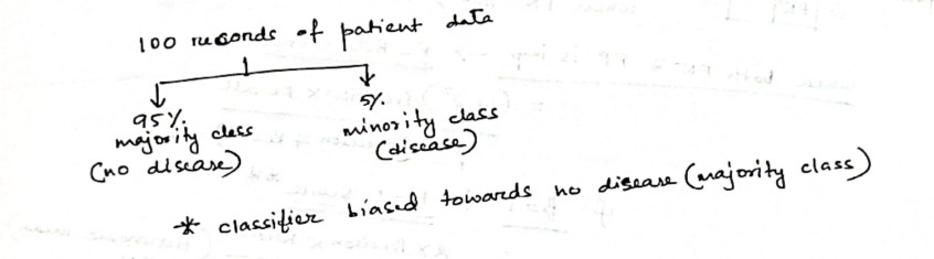
You're dealing with a dataset with two classes:
- Minority class (positive): Only 10 examples
- Majority class (negative): 990 examples
→ Total = 1000 instances
This results in severe imbalance:
❗ Why is this a problem?
- If a classifier always predicts "negative", it will be correct 99% of the time.
- That means a very high accuracy, but completely useless in real-world scenarios where the positive class is important (e.g., fraud detection, cancer diagnosis).
- Since cases like frauds or cancer diagnosis often hide under those 1 percentages, or sometimes even lower than that.
📊 Common Evaluation Metrics Under Class Imbalance
In class imbalance, you're usually trying to detect a rare but important event, like fraud (positive class). So, accuracy becomes meaningless. We use more targeted metrics.
1. Using a Confusion Matrix
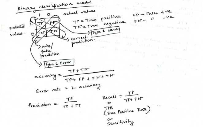
A confusion matrix is a table that displays the performance of a classification model by comparing its predictions to the actual labels of the data, especially highlighting the counts of correct and incorrect predictions for each class. This helps analyze where the model is struggling, particularly with under-represented classes, and is crucial for understanding the model's effectiveness in imbalanced datasets.
A confusion matrix summarizes predictions:
| Truth | Predicted Positive | Predicted Negative |
|---|---|---|
| Actual Positive | TP(True Positive) | FN(False Negative) |
| Actual Negative | FP(False Positive) | TN(True Negative) |
A confusion matrix is often used in binary classification problems, where operating under class imbalance, ML models often classify differently than what's expected between two categories.
Example:
Imagine we have 100 test samples:
- 10 are actual positive (e.g., fraud)
- 90 are actual negative (e.g., normal)
Let’s assume:
-
Out of the 8 predicted as fraud:
- 5 were truly fraud → ✅ True Positives (TP) = 5
- 3 were normal but wrongly flagged → ❌ False Positives (FP) = 3
So among the 90 actual normal cases:
- 3 were misclassified → FP = 3
- So, the remaining 87 were correctly predicted as normal → ✅ True Negatives (TN) = 87
And among the 10 actual frauds:
- 5 were detected → TP = 5
- 5 were missed and wrongly predicted as normal → ❌ False Negatives (FN) = 5
So this is our confusion matrix:
| Truth | Predicted Positive | Predicted Negative |
|---|---|---|
| Actual Positive | TP = 5 | FN = 5 |
| Actual Negative | FP = 3 | TN = 87 |
2. Precision (a.k.a Positive Predictive Value)
Precision answers the important question of:
"Out of all the cases I predicted as positive, how many were actually positive?"
- High precision means: When the model says "fraud," it’s usually right.
- Important when false positives are costly (e.g., spam filters, arresting people).
I mean, you wouldn't someone to be wrongly arrested, or your mail system to wrongly classify an important email as spam, right?.
3. Recall (a.k.a Sensitivity / True Positive Rate)
Recall answers this important question:
"Out of all the actual positives, how many did I catch?"
- High recall means: The model catches most of the actual frauds.
- Important when missing positives is dangerous (e.g., fraud detection, cancer screening).
You most certainly wouldn't want to miss a fraud detection, or a cancer screening, right?
4. F1 Score (harmonic mean of precision and recall)
"Balance between precision and recall"
- F1 score is useful when you want balance and care about both FP and FN.
- It punishes extreme imbalance (e.g., very high precision but very low recall).
So in our case, from the confusion matrix, we see that:
| Truth | Predicted Positive | Predicted Negative |
|---|---|---|
| Actual Positive | TP = 5 | FN = 5 |
| Actual Negative | FP = 3 | TN = 87 |
The model detected 5 frauds (TP = 5), but:
- It missed 5 other actual frauds → FN = 5
- It also wrongly flagged 3 normal transactions as frauds → FP = 3
Then:
So what do these metrics mean?
✅ Precision = 62.5%
"Out of all the cases the model predicted as fraud, 62.5% were actually fraud."
- So 37.5% of the flagged frauds were false alarms (false positives).
- This tells us the model is moderately precise, but still wastes some effort on false positives.
📉 Recall = 50%
"Out of all the actual frauds in the data, the model only caught half of them."
- So it missed 50% of actual frauds → that's 5 real frauds left undetected.
- This is critical in domains like fraud detection or medical diagnostics, where missing positives is risky.
⚖️ F1 Score = 55.5%
"The overall balance between catching frauds and avoiding false alarms is just slightly above average."
- F1 score is not great here, because recall is dragging it down.
- It shows your model is not confident or consistent in handling fraud detection.
🔍 Summary Table
| Metric | What it measures | High when... |
|---|---|---|
| Precision | Correctness of positive predictions | FP is low |
| Recall | Coverage of actual positives | FN is low |
| F1 Score | Balance of precision and recall | Both FP and FN are low |
| Metric | Value | Interpretation |
|---|---|---|
| Precision | 62.5% | Somewhat accurate when it does say “fraud,” but makes mistakes 37.5% of the time |
| Recall | 50% | Misses half of actual fraud cases, which is risky |
| F1 Score | 55.5% | Model needs tuning — it’s mediocre at both catching frauds and being accurate |
⚠️ Why This Is a Problem (Class Imbalance Angle):
If your dataset has 92 normal cases and 10 frauds, the imbalance ratio is ~1:9.
- The model is biased toward the majority class (normal transactions).
- Even a dumb model that always predicts 'normal' would be 92% accurate — but it would miss all frauds.
How to mitigate this problem?
Now knowing what the Class Imbalance Problem is and why is it a problem, we need to know how to deal with this problem.
We can roughly classify the approaches into two major categories: sampling based approaches and cost function based approaches.
1. Data Level Methods
🔁 a. Resampling Techniques
-
Oversampling: Add more copies of the minority class (frauds, in our case) to balance the dataset.
- ✅ Improves recall
- ❌ Risk of overfitting (especially with simple duplication)
-
Undersampling: Remove examples from the majority class (normal cases) to match the minority class.
- ✅ Reduces bias toward majority
- ❌ Risk of losing important information
🔬 b. SMOTE (Synthetic Minority Over-sampling Technique)
-
Creates synthetic data for the minority class by interpolating between actual minority examples.
-
✅ Better than simple oversampling
-
❌ May generate borderline or noisy samples
🧠 2. Algorithm-Level Methods
These modify the learning process rather than the data.
⚖️ a. Cost-Sensitive Learning
- Assigns higher penalties to misclassifying minority class (e.g., missing a fraud).
- Example: Use a cost matrix where FN for fraud is costlier than FP for normal.
📚 b. Weighted Classifiers
- Modifies learning algorithms (e.g., Decision Trees, SVM, Neural Networks) to weigh errors unequally.
- Often used in scikit-learn via the
class_weightparameter.
👥 c. Ensemble Methods (like Boosting & Bagging)
- Use multiple classifiers that focus more on minority class errors.
- Example: Balanced Random Forest or AdaBoost with cost-sensitive base learners
📊 3. Evaluation Metrics
Standard accuracy is misleading under imbalance. Use:
- Precision, Recall, F1-score (as you just saw)
- ROC-AUC: Measures tradeoff between TPR and FPR
- PR-AUC: Better when data is heavily skewed
Don't worry we won't study this many, only just two popular algorithms:
1. SMOTE (Synthetic Minority Oversampling Technique)
SMOTE (Synthetic Minority Oversampling Technique) is a sampling method for imbalanced datasets. It artificially generates new instances of the minority class by interpolating between existing examples.
🤔 Why not just duplicate samples?
If you just duplicate rare cases, models might overfit, i.e., memorize those few examples. SMOTE avoids this by synthesizing new, slightly varied examples — helping the model generalize.
🔧 How SMOTE Works (Step-by-Step)
- For each minority class sample
x, do: - Find
knearest neighbors among other minority class samples (default:k=5). - Randomly pick one neighbor
x. - Generate a new synthetic sample between them:
where
Example
Imagine we have 3 minority class points:
| Sample | X₁ | X₂ | Class |
|---|---|---|---|
| A | 1 | 1 | 1 |
| B | 1 | 2 | 1 |
| C | 2 | 1 | 1 |
| D | 3 | 3 | 0 |
| E | 3 | 4 | 0 |
| F | 4 | 3 | 0 |
| G | 4 | 4 | 0 |
Step 1: Identify majority and minority classes
- Class 1 → Appears in 3 rows
Minority class - Class 0 → Appears in 4 rows
Majority class
Let's focus on the minority class:
Samples A (1,1), B (1,2), C (2,1)
Step 2: Find k-nearest neighours
We’ll now apply SMOTE with k = 2, and generate 1 new synthetic sample for point A.
But what does this k parameter do?
kis the number of nearest neighbors SMOTE considers for each minority class sample when generating synthetic points.- It controls how diverse the synthetic samples will be.
When generating a new synthetic point:
- Pick a minority class sample
x - Find its
knearest neighbors among other minority class samples - Randomly choose one of those
kneighbors to interpolate with - Create a new point between
xand that neighbor
So we have our minority class sample as A (1,1)
Now we need to find the k-nearest neighbours. That's just done using the euclidean distance formula:
So,
Distance to B(1,2):
Distance to C(2, 1):
So, neighbours = B and C
SMOTE is only applied to minority classes, that's why we only compute the distances of A to B and C, the other two minority classes in this dataset, besides A.
Step 3: Interpolate and generate a synthetic sample
The SMOTE interpolation between two points A and B formula is:
A python example would be:
import numpy as np
synthetic = A + np.random.random(0,1) * (B - A)
We can randomly select any one of the nearest k-neighbours as well (if and only if all the neighbours are equidistant), no hard and fast rule of selecting one particular neighbour always.
So let's say I get :
0.6 as a random number
- B - A = (1,2) - (1,1) = (0,1)
- New sample = (1,1) + 0.6 * (0,1) = (1, 1.6)
So we get a new synthetic sample: (1, 1.6), class = 1
Similarly for B and C
For point B, we find the nearest neighbours:
Even though, we are sure that B's nearest neighbours are A and C, we still need to recompute the nearest neighbours since distance is symmetric and often in different datasets things are not the same.
So for B, we have the other two same class members A and C
Distance of B(1,2) to A(1,1) =
Distance of B(1,2) to C(2,1) =
So both A and C are equidistant (same distance) from B. Hence, B’s 2 nearest neighbors are A and C, just like A’s.
Now we choose another random number let's say 0.5
So to synthesize a new sample for B, let's use point C:
import numpy as np
synthetic = B + np.random.random(0,1) * (C - B)
So this will be:
So we have a new sample (1.5, 1.5) belonging to class 1
Let's try for point C.
At this point we know that A, B and C are equidistant to each other, but still let's calculate:
Distance of C(2,1) to A(1,1) =
Distance of C(2,1) to B(1,2) =
As we can see here that the distance of C to B is a bit more than the distance of C to A.
In this case we will select the lowest distance neighbour, which is A.
So,
Let's work with another random number, for example 0.1
Interpolating between C and A would get us:
So we have a new class 1 sample as (1.9, 1)
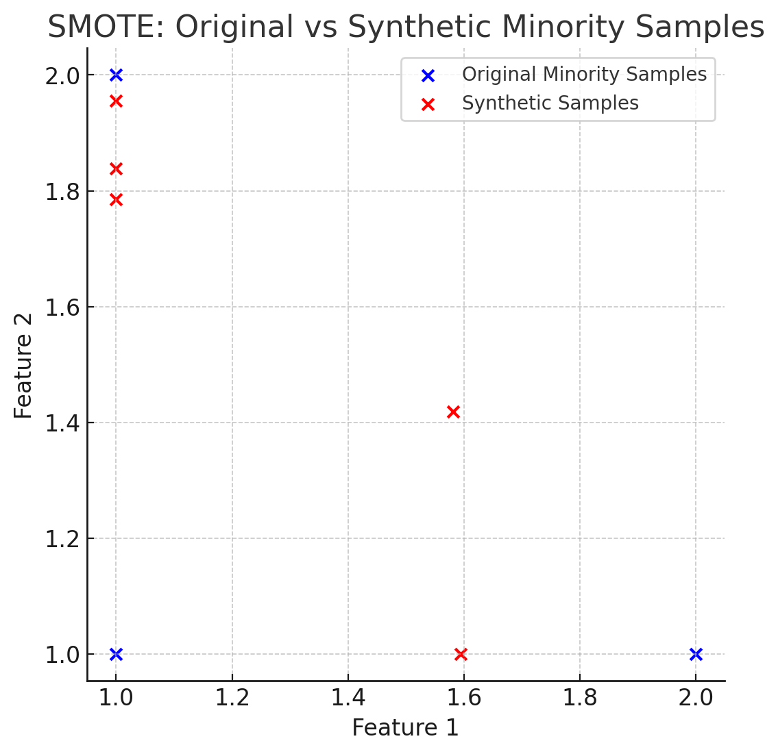
Here's a better visualization where you can see that the generated synthetic samples allow more range of exploration for the model on the minority class, thus helping better to balance out the dataset.
2. Cost Sensitive Learning
What is Cost-Sensitive Learning?
In traditional classifiers, all misclassifications are treated equally. But in real-world imbalanced datasets (like fraud detection or disease diagnosis), misclassifying a minority class sample (e.g., saying a cancer patient is healthy) is far more costly than misclassifying a majority one.
Cost-sensitive learning assigns different penalties (costs) to different types of errors. The goal becomes:
👉 Minimize the total cost of misclassification, rather than just the number of errors.
How it Works:
-
Cost Matrix (C): A table that defines the cost of every prediction outcome.
Example:
| Actual / Predicted | Predicted: Positive | Predicted: Negative |
|---|---|---|
| Actual: Positive | 0 (Correct prediction) | 10 (False Negative) |
| Actual: Negative | 1 (False Positive) | 0 (Correct prediction) |
What this means:
- If you correctly predict a positive or a negative → cost is 0.
- If you miss a positive (i.e., say "No Fraud" when it was fraud) → cost is 10.
- If you mistakenly flag a negative as positive (false alarm) → cost is 1.
This matrix says:
- Misclassifying a positive (minority class) as negative costs 10
- Misclassifying a negative as positive costs 1
-
Loss Function Modification: Instead of using a regular loss (like accuracy), the classifier is trained to minimize total cost using this cost matrix.
-
Integration with Algorithms:
- Some classifiers like Decision Trees (e.g., C4.5, CART), SVMs, and Logistic Regression can be modified to use a cost matrix.
- Some libraries (like
sklearn) allow you to assignclass_weight='balanced'or manually assign weights to favor the minority class.
So it's kinda similar to reinforcement learning.
Example
🎯 Scenario: Fraud Detection
You have a model that classifies transactions as:
Positive= FraudNegative= Not Fraud
You’ve built a classifier that gives the following predictions:
| Actual \ Predicted | Predicted Fraud | Predicted Not Fraud |
|---|---|---|
| Fraud | 2 | 3 |
| Not Fraud | 3 | 92 |
This gives us:
- TP =
2(Actually fraud) - FN =
3(Misclassified as not fraud / missed frauds) - FP =
3(Misclassified as fraud) - TN =
92(Actually not fraud)
📊 Cost Matrix
| Value | Predicted Fraud | Predicted Not Fraud |
|---|---|---|
| Actual Fraud | +0 | +10 |
| Actual Not Fraud | +1 | 0 |
Interpretation:
- False Negative (Fraud classified as not fraud) → high cost of 10 units (a fraud went undetected!)
- False Positive (Normal classified as fraud) → minor inconvenience, cost of 1 unit
- Correct predictions → 0 cost
🧮 Cost-Sensitive Total Cost
We calculate total cost from each error type:
- FN cost = 3 × 10 = 30
- FP cost = 3 × 1 = 3
✅ Total Cost = 30 + 3 = 33
Now, suppose a different model gives:
| Actual \ Predicted | Predicted Fraud | Predicted Not Fraud |
|---|---|---|
| Fraud | 3 | 2 |
| Not Fraud | 6 | 89 |
Now:
- TP = 3
- FN = 2
2 10 = 20 - FP = 6
6 1 = 6
✅ New Total Cost = 26
Even though the new model had more false positives, it saved on more critical false negatives, and had lower total cost. So it's better in cost-sensitive learning, even if raw accuracy seems worse!
Bayesian Classification -- Naive Bayes Classifier
Pre-requisites
1. The Bayes Theorem
https://www.youtube.com/watch?v=SktJqrYereQ&list=PLxCzCOWd7aiHGhOHV-nwb0HR5US5GFKFI&index=45
Bayes' theorem provides a way to update the probability of a hypothesis based on new evidence. It essentially answers the question: If we know the likelihood of certain evidence given a hypothesis, and we know the probability of the hypothesis itself, how does observing the evidence change our confidence in the hypothesis?
The formula is as follows:
Here:
Posterior Probability — the probability of the hypothesis being true given that we have observed evidence . : Likelihood — the probability of observing evidence if the hypothesis is true. : Prior Probability — the initial probability of the hypothesis , before seeing any evidence. : Marginal Probability of B — the overall probability of observing evidence under all possible scenarios.
The idea behind Bayes' theorem is to update our belief in a hypothesis as new data (or evidence) becomes available. This helps refine predictions and decisions in situations where we are working with incomplete information.
A better understanding of the terminologies.
Let's understand this in a more simple language.
So we can visualize the situation using a graph:
flowchart LR;
	E-->A
	E-->B
Let's say we have two events, A and B. Both have an equal chance of happening.
-
: This represents the probability of event A happening given that event B has already happened. - “Given that B is true” means we’re considering only situations where B has already occurred and are looking at how likely A is to happen under that condition.
- For example, if A represents having a disease and B represents testing positive for the disease, then
is the probability of having the disease given that you've tested positive.
-
: Similarly, this is the probability of event B happening given that event A has already happened. - “Given that A is true” means we’re considering only scenarios where A has occurred and are interested in the likelihood of B under that condition.
- In the example above,
would be the probability of testing positive if you actually have the disease.
-
and : These are just the independent probabilities of each event happening without any conditions. - Since we assumed both events have an equal chance of occurring,
and , but this is just an assumption for simplicity. In real scenarios, these probabilities are often quite different, and might not always have a 50-50 chance of occurrence.
- Since we assumed both events have an equal chance of occurring,
To sum up,
In classification terms
If we have a dataset:
| Class | Features |
|---|---|
| Spam | Email1 |
| Not Spam | Email2 |
which means:
⚠️ Important:
- In practice, we often skip calculating
explicitly because it’s constant for all classes, and we only care about comparing the relative likelihoods of each class. - So, the classification decision is usually made using the unnormalized numerator:
The "Naive" part
We assume that all features are independent, i.e.,
This “naivety” makes it efficient and simple to compute, hence Naive Bayes.
Steps for Naive Bayes Classification
-
Calculate prior probabilities of each class
-
For a new input, compute likelihood for each feature given the class
-
Compute the posterior probability for each class
-
Predict the class with the highest posterior
📨 Example Problem:
We want to classify whether an email is Spam or Not Spam, based on the words it contains.
📊 Dataset (Training):
| Email # | Text | Class |
|---|---|---|
| 1 | "buy cheap meds" | Spam |
| 2 | "cheap meds available" | Spam |
| 3 | "meeting at noon" | Not Spam |
| 4 | "project meeting tomorrow" | Not Spam |
🧾 Vocabulary (all unique words):
[buy, cheap, meds, available, meeting, at, noon, project, tomorrow]
So, V = 9 (vocabulary size)
Step 1. Calculate Prior Probabilities
Let’s calculate how likely Spam and Not Spam are:
- Total emails : 4
- Spam emails = 2 .
- Non spam emails = 2.
Step 2. Word Frequencies (with Laplace Smoothing)
Pre-requisite : Laplace smoothing
Laplace Smoothing (also called add-one smoothing) is a technique used to handle zero probabilities in probabilistic models like Naive Bayes.
In Naive Bayes we calculate :
But what if a word in the test email never appeared in the training emails of a certain class?
For example:
If the word "cheap" never appeared in Not Spam emails:
And since Naive Bayes multiplies probabilities:
That one zero wipes the whole product out — the probability becomes zero, even if other words strongly point toward Not Spam.
This means that any email with the word "cheap" in it will be classified as spam, even if the context of the email was something entirely different, pointing to not spam.
✅ Laplace Smoothing fixes this by adding 1 to every word count:
Where V is the vocabulary size (number of unique words). This ensures:
- No word gets a zero probability.
- The model is more robust to unseen words.
So,
Let's count how often each word appears in Spam and Not Spam emails.
| Email # | Text | Class |
|---|---|---|
| 1 | "buy cheap meds" | Spam |
| 2 | "cheap meds available" | Spam |
| 3 | "meeting at noon" | Not Spam |
| 4 | "project meeting tomorrow" | Not Spam |
Spam Word Counts:
- "buy" : 1
- "cheap": 2
- "meds": 2
- "available": 1
Total words in Spam = 6
Not Spam Word Counts
- "meeting": 2
- "at": 1
- "noon": 1
- "project": 1
- "tomorrow": 1
Total words in Not Spam = 6
Now, apply Laplace Smoothing:
so denominator for either class is 6 + 9 = 15
Spam Conditional Probabilities (Likelihoods):
- Any other words which are not in the spam class (like meeting for example): will have this probability thanks to Laplace smoothing:
. This ensures that all words which belonged to a specific class in the training set are not automatically assigned that class due to having zero probability of being in the other class. (Like the word "cheap" being assumed a spam word despite the context not being spam).
Not Spam Conditional Probabilities (Likelihoods):
- Any other words which are not in the Not Spam class (like cheap for example): will have this probability thanks to Laplace smoothing:
. This ensures that all words which belonged to a specific class in the training set are not automatically assigned that class due to having zero probability of being in the other class. (Like the word "cheap" being assumed a spam word despite the context not being spam).
Step 3: Classify a New Email
"cheap project meds".
We break it down into features list:
["cheap", "project", "meds"]
- Compute Score for Spam
- Compute Score for
Now compare the values:
The greater value is the predicted classifier value:
A quick
So, the classifier predicts : Spam.
Graph Mining
Graph Mining is the process of discovering interesting and useful patterns and knowledge from data represented as graphs.
-
A graph is a data structure consisting of:
- Nodes (vertices): Represent entities (e.g., users, web pages, proteins).
- Edges (links): Represent relationships or interactions between entities (e.g., friendships, hyperlinks, reactions).
📘 Types of Graphs:
| Type | Description |
|---|---|
| Directed Graph | Edges have direction (e.g., Twitter follows) |
| Undirected Graph | Edges are bidirectional (e.g., Facebook friends) |
| Weighted Graph | Edges have weights (e.g., distances or strengths) |
| Labeled Graph | Nodes/edges have labels (e.g., atom types in chemistry) |
| Dynamic Graph | Graph structure evolves over time |
⚙️ Key Graph Mining Tasks:
-
Frequent Subgraph Mining
- Find subgraphs that occur frequently across multiple graphs (like Apriori but for graphs).
- E.g., identify common molecular structures in drug discovery.
-
Graph Classification
- Predict the category of a graph (e.g., is this chemical compound toxic?).
-
Community Detection / Clustering
- Group nodes that are densely connected (e.g., friend groups in social networks).
-
Link Prediction
- Predict missing or future edges (e.g., who might become friends next?).
-
Graph Similarity / Matching
- Measure how similar two graphs or substructures are.
-
Frequent Subgraph Enumeration
- Identify all subgraphs that meet a minimum frequency threshold.
🧠 Common Graph Mining Algorithms:
| Task | Example Algorithm |
|---|---|
| Frequent subgraph mining | gSpan, Subdue |
| Classification | Graph Kernels, GNNs |
| Clustering | Louvain Method |
| Link prediction | Adamic-Adar, Katz |
(We won't be doing all of these, don't worry, we are only concerned with frequent subgraph mining here).
Common types of graph patterns
Think of these as specific "shapes" or structures we might be looking for within a larger graph:
-
Paths: A sequence of connected nodes. Imagine a chain of friendships in a social network. Finding long paths might indicate how information or influence can spread. In a road network, a path represents a route between two locations.
-
Cliques: A subgraph where every node is directly connected to every other node. This represents a highly cohesive group. In our social network, a clique would be a tight-knit group of friends where everyone knows each other. Finding cliques can help identify strong communities.
-
Stars: A central node connected to several other nodes, but those other nodes are not necessarily connected to each other. Think of a popular blogger (the central node) with many followers (the surrounding nodes). Identifying star structures can help find hubs of activity or influence.
1. gSpan algorithm for frequent subgraph mining
🔷 Key Ideas:
- Uses DFS (Depth First Search) Codes to canonicalize graphs.
- Prunes subgraphs by extending only minimal DFS codes.
- Avoids the costly task of checking isomorphism explicitly.
🔁 Basic Steps:
- Convert graphs to canonical DFS codes (unique codes for isomorphic subgraphs)
- Start with single-edge subgraphs
- Recursively extend subgraphs by adding edges in DFS order
- Prune subgraphs whose DFS code is not minimal
- Check frequency: if support ≥
min_sup, keep it
Example dataset
3 Simple Graphs (undirected, labeled)
We'll work with this graph database:
- Graph 1 (
)
A — B — C
- Graph 2 (
)
A — B — D
- Graph 3 (
)
B — C — D
Let’s represent each graph as a list of labeled edges:
: (A-B), (B-C) : (A-B), (B-D) : (B-C), (C-D)
When we say “representing a graph as a list of labeled edges,” we mean breaking the graph down into its edges and describing each edge by the labels of the nodes it connects.
This could go on as a list of tuples as long as we keep finding the connecting node which connects other nodes.
🎯 Goal:
Find all subgraphs that appear in at least 2 graphs (min_sup = 2).
Step 1: Identify all the 1-edge Subgraphs (Frequent edge patterns)
Now what do we mean by "1-edge" subgraphs?
When we say 1-edge subgraph, we mean a subgraph that consists of:
- Exactly 2 nodes, and
- 1 edge connecting them
Like this!
- SG₁: (A-B), (B-C)
Each tuple consists of two nodes and 1 edge.
🧱 Why Start with 1-Edge Subgraphs?
-
Foundation for Growth:
-
In frequent subgraph mining, you start small and grow only those subgraphs that are frequent.
-
So we first find all frequent 1-edge subgraphs, then try to extend them to 2-edge subgraphs, 3-edge, and so on.
-
-
Efficiency:
-
This is called the Apriori Principle:
"If a pattern is not frequent, any larger pattern containing it cannot be frequent." -
So we avoid wasting time generating large subgraphs that contain infrequent 1-edge subgraphs.
-
-
Systematic Enumeration:
- Starting from the smallest ensures we don't miss any possible frequent patterns.
- Similar strategy is used in frequent itemset mining (like Apriori or FP-Growth).
So ,
We’ll extract all unique 1-edge subgraphs and check their support(whether these specific subgraphs occurs in the specific pattern in the original graphs,
- SG₁: (A-B), (B-C)
- SG₂: (A-B), (B-D)
- SG₃: (B-C), (C-D)
We have our minimum_support = 2.
| Subgraph | Appears In | Support |
|---|---|---|
| (A-B) | G₁, G₂ | 2 ✅ |
| (B-C) | G₁, G₃ | 2 ✅ |
| (B-D) | G₂ | 1 ❌ |
| (C-D) | G₃ | 1 ❌ |
So, we will keep the subgraphs which meet the minimum_support threshold.
Keep: (A-B), (B-C).
Step 2: Try to extract 2-edge subgraphs
📈 Then Comes 2-Edge Subgraphs
Once you find which 1-edge subgraphs are frequent, you generate 2-edge candidates by:
- Joining two 1-edge subgraphs that share a common node
- Then checking if these 2-edge subgraphs are frequent
And so on:
- 3-edge subgraphs from frequent 2-edge ones
- 4-edge from 3-edge…
So it's just like the apriori algorithm but for graphs.
So we can create a 2-edge subgraph as:
= (A-B-C)
Now we check whether this subgraph (pattern) occurs in the original graph sets or not
- Graph 1 (
)
A — B — C
- Graph 2 (
)
A — B — D
- Graph 3 (
)
B — C — D
We see that the pattern A - B - C appears in:
(A - B - C) has (A - B) but not (B-C), so no. has (B-C) but not (A-B), so no.
So support of
Step 3: Try other possible combinations
Are there any?
We already had the 1-edge frequent patterns as (A-B) and (B-C), so I don't think there are any more possible pairwise combinations.
So, finally:
✅ Final Result: Frequent Subgraphs with min_sup = 2
| Subgraph | Support |
|---|---|
| (A-B) | 2 |
| (B-C) | 2 |
Conclusion
Just like Apriori in association rule mining:
- You start with small frequent patterns (e.g. 1-edge subgraphs),
- Then you extend them to form larger patterns (e.g. 2-edge, 3-edge...),
- And you only consider extensions of patterns that were already frequent.
This avoids wasting time on unlikely combinations — that’s the Apriori principle in action.
Social Network Analysis (Brief Theory and a few examples)
🌐 What is Social Network Analysis?
Social Network Analysis studies relationships and interactions between entities, represented as a graph:
- Nodes (Vertices): People, users, organizations, etc.
- Edges (Links): Friendships, communications, collaborations, etc.
It’s widely used in:
- Social media (e.g. Facebook, Twitter),
- Recommendation systems,
- Influence analysis,
- Fraud detection,
- Biology (e.g. protein interaction networks).
🔍 Key Concepts in SNA
Here are the foundational terms and metrics:
-
Degree Centrality
- Number of edges connected to a node.
- Shows how "popular" or active a node is.
-
Betweenness Centrality
- How often a node lies on the shortest path between other nodes.
- High betweenness = key "broker" or bridge.
-
Closeness Centrality
- How close a node is to all other nodes (via shortest paths).
- High closeness = can quickly interact with everyone else.
-
Eigenvector Centrality
- Like degree centrality, but considers quality of connections
- A node connected to influential nodes gets a higher score.
-
Clustering Coefficient
- Measures how tightly-knit a node’s neighbors are.
- High value = tight-knit groups or communities.
-
Community Detection
- Algorithms (like Girvan–Newman, Louvain) that identify subgroups or clusters within a large network.
-
Graph Density
- Proportion of actual edges to total possible edges.
🧠 Real-World Analogy
Imagine a school:
- Students = Nodes
- Friendships = Edges
- A student with the most friends has high degree centrality.
- A student who connects two friend groups has high betweenness.
- A student who's well connected to other central students has high eigenvector centrality.
Example Graph (Friendship Network)
Let’s say we have the following social graph with people as nodes:
A — B — C
|   |   |
D   E   F
Edges (friendships):
- A connected to B and D
- B connected to A, C, and E
- C connected to B and F
- D connected to A
- E connected to B
- F connected to C
Now how do we analyze this network and interpret the analysis?
🔎 Metric Calculations (Simple):
-
Degree Centrality (How many direct connections each person has)
- A: 2 (B, D)
- B: 3 (A, C, E) → highest
- C: 2 (B, F)
- D: 1 (A)
- E: 1 (B)
- F: 1 (C)
🎯 Interpretation: B is the most active or "popular" node.
-
Betweenness Centrality (How often a node acts as a bridge)
- B connects A ↔ C,
- B connects A ↔ E ,
- B connects C ↔ E
- A connects B ↔ D
- C connects B ↔ F
- D, E and F are leaf nodes.
🎯 Interpretation: B is a major mediator, crucial for info flow.
-
Closeness Centrality (How fast can you reach everyone?)
- B has the smallest average distance to others (Since B bridges many nodes to each other.)
🎯 Interpretation: B can spread news or gossip the fastest.
-
Clustering Coefficient (Are your friends also friends?)
- B’s neighbors (A, C, E) are not connected → low coefficient
- A’s neighbors (B, D) are not connected either
🎯 Interpretation: The network isn't tightly knit. People’s friends are not necessarily friends with each other.
📌 Why This Is Useful
- In marketing: Target person B to maximize word-of-mouth.
- In rumor control: Monitor B to catch spread early.
- In community detection: This graph may be split into subgroups (A–D–B–E) and (C–F).
- In cybersecurity: A highly central node like B may be critical to watch for unusual communication.
- Hackers might perform social engineering attacks on B since B has access to other people so there's a high chance of propagation.
- Unscrupulous people might choose B as an effective target to spread misinformation to the groups A-D, C-F and to E.
Since social networks are quite complicated and we generally can't optimize social networks, however from a technical standpoint, an optimization would include reducing the dependency on B and clustering all the nodes together, or connecting them thoroughly, something like this:
 - - - -
|       |
A — B — C
| \ | / |
D - E - F
|       |
 - - - -
🖧 Example: Computer Network Graph
Nodes = Servers/Routers
Edges = Direct communication or data flow
     A
    / \
   B   C
    \ / \
     D   E
          \
           F
Connections:
- A ↔ B, A ↔ C
- B ↔ D
- C ↔ D, C ↔ E
- E ↔ F
🔍 Analysis:
-
Degree Centrality (How many direct connection a node has)
- A: 2 (B, C)
- B: 2 (A, D)
- C: 3 (A, D, E) ← highest
- D: 2 (B, C)
- E: 2 (C, F)
- F: 1 (E)
🧠 Interpretation: C is the most connected router — high traffic risk.
B is the second highest connected router.
E and A are the third and fourth highest connected routers.
-
Betweenness Centrality (How often a node acts as a bridge to other nodes?)
- C lies on the paths A↔F, B↔F, D↔F → most critical bridge
- D connects B to C (less critical)
🔥 Interpretation: Taking down C disrupts entire network → it's a single point of failure.
-
Closeness Centrality (How fast can which node reach all other nodes?)
-
C is closest to all other nodes, meaning:
- Least number of hops to any node
- Low latency if it acts as a central router
📈 Interpretation: C is ideal for deploying firewall or monitoring software.
-
-
Network Resilience Insight
- If C is compromised, F becomes isolated, and paths become longer or break.
⚠️ C must be hardened or redundancy should be added (e.g., F ↔ D).
-
Clustering coefficient (Are the other nodes well connected?)
- B is connected to nodes A and D
- E and F are connected to each other
- B is not connected to E
- B is not connected to F
- B is not connected to C
- C is connected to A, D, E
- A is not connected to D
- A is not connected to E
- A is not connected to F
- D is not connected to C
- D is not connected to E
- D is not connected to F
Or
Clustering Coefficient = fraction of a node’s neighbors that are also connected to each other.
This says that overall C is the most well connected node, followed by B, followed by E.
But overall the all the nodes are not that well connected.
Low clustering implies a sparse network structure with few redundant paths — making it vulnerable to targeted attacks.
-
Eigenvector Centrality (Who is connected to the well-connected nodes?
- B is connected to nodes A and D
- E and F are connected to each other
- B is not connected to E
- B is not connected to F
- B is not connected to C
- C is connected to A, D, E --> High
- A is not connected to D
- A is not connected to E
- A is not connected to F
- D is not connected to C
- D is not connected to E
- D is not connected to F
As we can see, C provides access to the nodes A, D and E, basically acting as a bridge between the upper and lower halves of the graph, since A, D and E are quite well-connected themselves.
🛡️ Practical Use:
- Cybersecurity: Prioritize securing C, B, A and E.
- Load Balancing: Optimize routing through A and D to reduce pressure on C
- Attack Simulation: Know which nodes cause most damage when down
- In a real corporate network, C might represent the core switch or a DMZ router — a breach here can cause wide-scale lateral movement.
An optimized version of this network would be something like:
 - - A - - -
|   / \    |
|  B - C---|
|  | \ / \  |
-----D - E--|
   | |    \
   --------F
This is a more well clustered network, a mesh topology which is excellent for fault tolerance, high throughput, and redundancy.
🔧 Improvements in the New Graph:
-
Resilience:
Every node now has multiple alternate paths. If C fails, traffic can reroute through B–D–E or other paths. -
Reduced Bottlenecks:
No single node is now a choke point like C was in the previous example. Traffic load can be evenly distributed. -
Clustering Coefficient:
Significantly increased — almost every node’s neighbors are interconnected. This is ideal in networks needing low-latency group communication, like:- Distributed databases
- Peer-to-peer systems
- Multiplayer game servers
-
Security:
Attackers can no longer take down the network by compromising just one or two nodes. You’ve eliminated the single point of failure.
⚖️ Trade-offs to Consider:
-
Cost/Complexity:
More links = more hardware, maintenance, and routing complexity. In real systems, we often go for hybrid topologies to balance cost with resilience. -
Flooding Risk:
In broadcast-heavy scenarios, too many connections may lead to redundant traffic unless controlled by smart routing (like OSPF or spanning tree protocols).