Supervised Learning -- Machine Learning Module 1
Index
1. Basic Methods (Data Mining Module 2 Recap)
2. Linear Models
1. Linear Regression
2. Generalized Linear Models (GLM)
3. GLM Support Vector Machines(SVMs) - The Geometric Approach to Supervised Learning
Support Vector Machines Nonlinearity and Kernel Methods
Major Kernel Functions (Don't think about this too much, just know the names, and the formulae if possible.)
Beyond Binary Classification: Multi-class/Structured Outputs, Ranking
1. Basic Methods
This is basically a recap section from Data Mining semester 6.
If you do not wish to recap this part, you may skip ahead to: 2. Linear Models.
1. Distance Based methods
1. Euclidean Distance
- Most common distance metric
- Straight-line distance between two points
- Formula for two points (x₁, y₁) and (x₂, y₂):
- Extends to higher dimensions
2. Manhattan Distance
- Sum of absolute differences along each dimension
- Also called "city block" or "taxicab" distance
- Formula:
3. Other Distance Metrics
- Minkowski Distance: Generalization of Euclidean and Manhattan
- Cosine Distance: Based on angle between vectors (Check Data Mining Module 3)
- Hamming Distance: For categorical data
Main Distance Based methods
1. K-Means Clustering
Basic Idea:
Divides n objects into k clusters, where each object belongs to the cluster with the nearest mean (called the centroid).
The K-Means algorithm begins by randomly assigning each data point to a cluster. It then iteratively refines the clusters' centroids until convergence. The refinement process involves calculating the mean of the data points assigned to each cluster and updating the cluster centroids' coordinates accordingly. The algorithm continues to iterate until convergence, meaning the cluster assignments no longer change. K-means clustering aims to minimize the sum of squared distances between each data point and its assigned cluster centroid.
Before we proceed further, let's understand about :
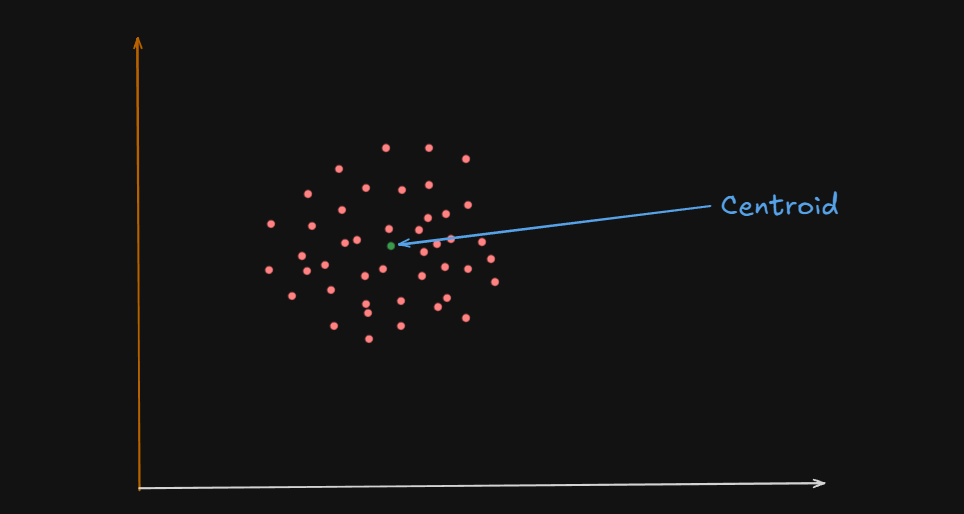
What is a Centroid?
A centroid is the geometric center of a cluster.
Or
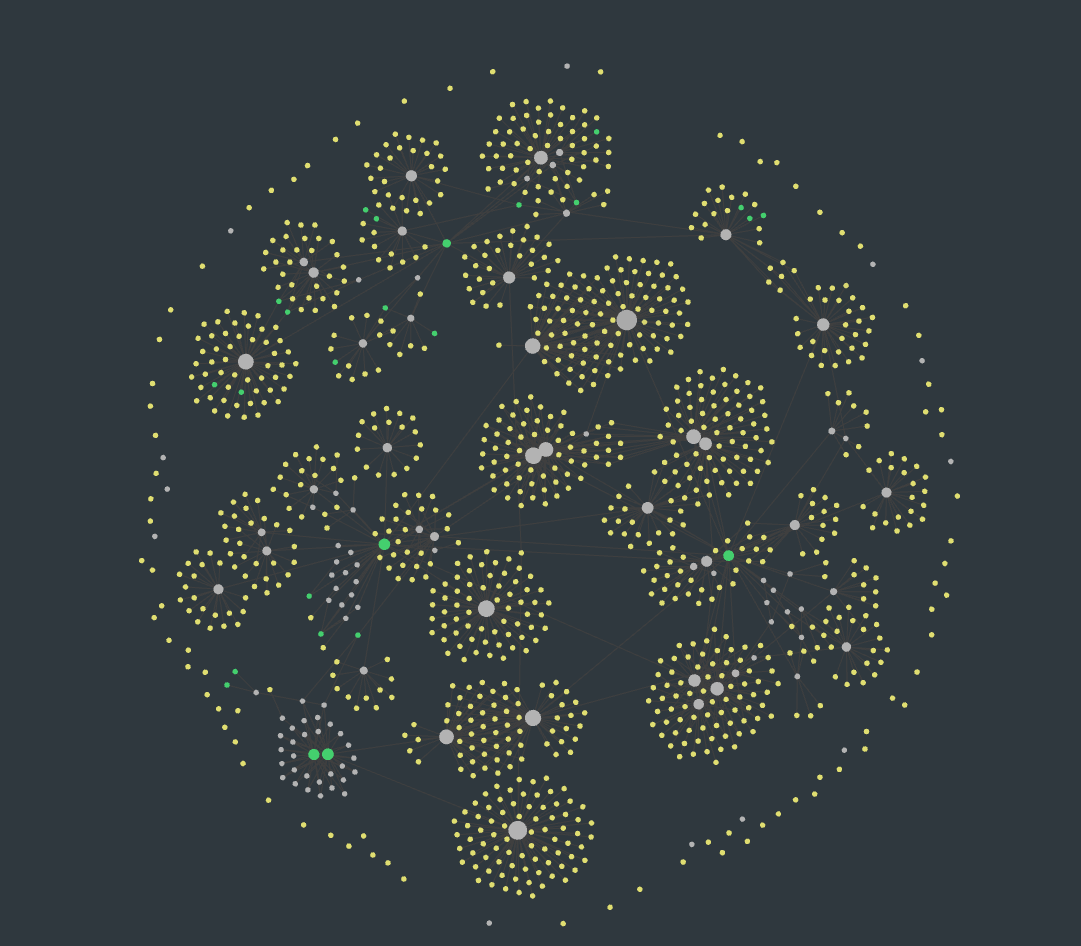
One could say that the centroid of these clusters are the big white circles at the center, and in some cases, the green circles
It’s like the average position of all the points (data samples) assigned to that cluster.
For example :
Let’s say you have a 2D space where each data point is represented by coordinates:
| Point | X | Y |
|---|---|---|
| A | 2 | 4 |
| B | 4 | 6 |
| C | 3 | 5 |
| If these three points belong to a single cluster, the centroid’s coordinates would be calculated like this: |
So the centroid of all these data points is
In higher dimensions(more number of variables), the centroid is still just the mean of each coordinate (feature) across all points in the cluster and the centroid formula scales as follows :
Why Is It Important?
1️⃣ The centroid acts like the "anchor" for a cluster. 2️⃣ During the K-Means algorithm:
- Data points are assigned to the cluster whose centroid is closest.
- Centroids are recalculated based on the new points assigned.
- This process continues until centroids stop changing.
Important:
- The centroid might not be an actual data point.
- It’s just the mathematical center, and sometimes no real data point is located there.
- In contrast, K-Medoids uses real data points as centers, not averages.
So, getting back to K-Means clustering,
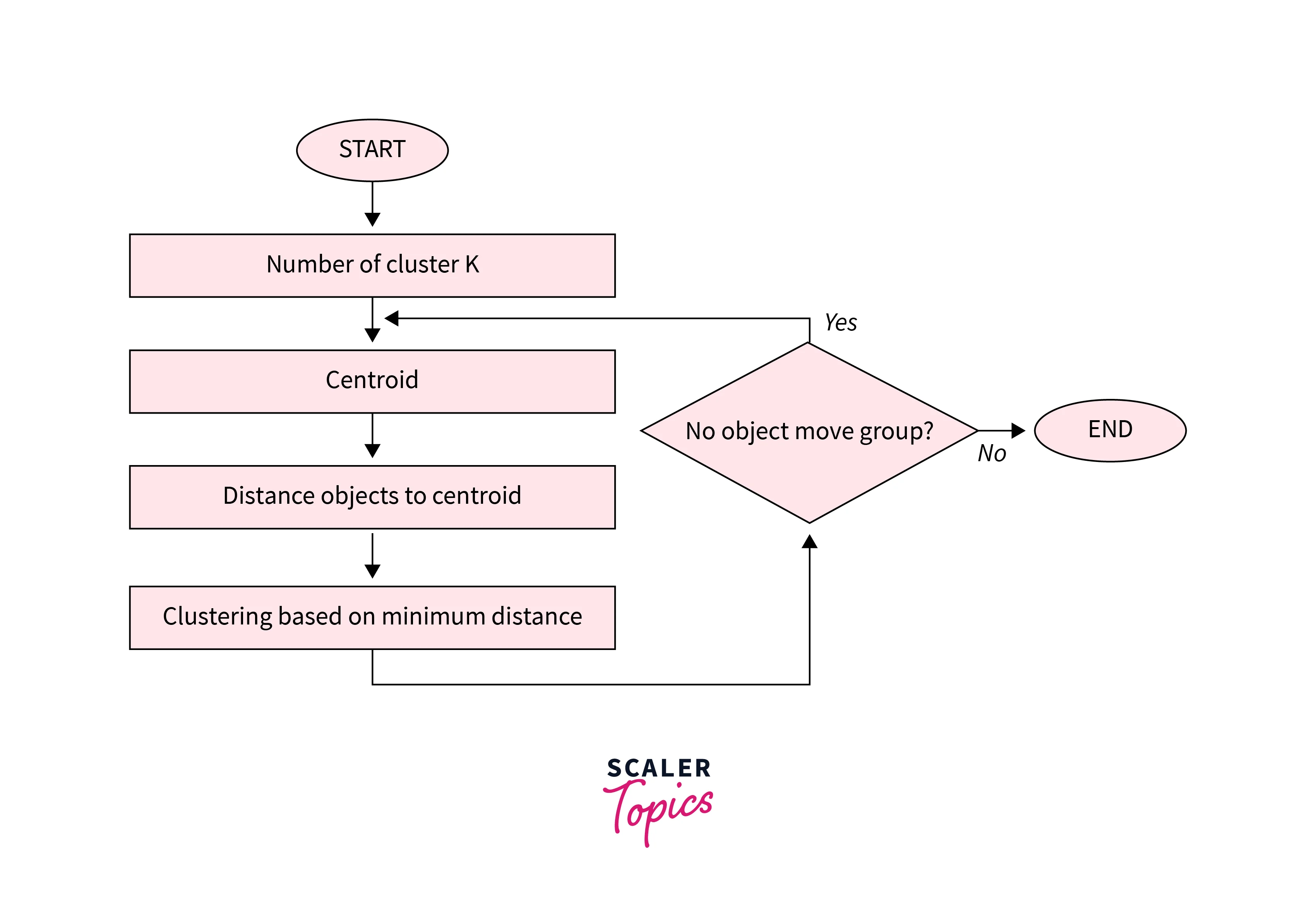
Algorithm of K-Means clustering
- Choose the number of clusters
k. - Randomly choose
kcentroids. - Assign each point to the nearest centroid. (This is done by calculating the distance of a point to all the centroids then assigning that point to the centroid with the lowest distance, thus creating a cluster)
- Re-compute centroids as the mean of all points in the cluster (using the centroid formula).
- Repeat steps 3 & 4 until centroids don’t change (convergence is reached) or a maximum number of iterations is reached.
Advantages of K-Means
Here are some advantages of the K-means clustering algorithm -
- Scalability - K-means is a scalable algorithm that can handle large datasets with high dimensionality. This is because it only requires calculating the distances between data points and their assigned cluster centroids.
- Speed - K-means is a relatively fast algorithm, making it suitable for real-time or near-real-time applications. It can handle datasets with millions of data points and converge to a solution in a few iterations.
- Simplicity - K-means is a simple algorithm to implement and understand. It only requires specifying the number of clusters and the initial centroids, and it iteratively refines the clusters' centroids until convergence.
- Interpretability - K-means provide interpretable results, as the clusters' centroids represent the centre points of the clusters. This makes it easy to interpret and understand the clustering results.
Disadvantages of K-Means
Here are some disadvantages of the K-means clustering algorithm -
- Curse of dimensionality - K-means is prone to the curse of dimensionality, which refers to the problem of high-dimensional data spaces. In high-dimensional spaces, the distance between any two data points becomes almost the same, making it difficult to differentiate between clusters.
- User-defined K - K-means requires the user to specify the number of clusters (K) beforehand. This can be challenging if the user does not have prior knowledge of the data or if the optimal number of clusters is unknown.
- Non-convex shape clusters - K-means assumes that the clusters are spherical, which means it cannot handle datasets with non-convex shape clusters. In such cases, other clustering algorithms, such as hierarchical clustering or DBSCAN, may be more suitable.
- Unable to handle noisy data - K-means are sensitive to noisy data or outliers, which can significantly affect the clustering results. Preprocessing techniques, such as outlier detection or noise reduction, may be required to address this issue.
2. K-Medoids Clustering
Similar to K-Means, but instead of using the mean as a center, it uses an actual data point (called a medoid) to represent the center.
Before, we proceed with that however,
What is a Medoid?
A medoid is the most centrally located actual data point within a cluster.
Unlike a centroid (which is often an average, and not always a real data point) —
a medoid is always one of the original, real points from your dataset.
Imagine you have a group of houses on a map, and you want to choose a meeting point for a neighborhood gathering:
- Centroid (K-Means) would give you the average of all coordinates — this could end up in the middle of a lake or someone’s rooftop!
- Medoid (K-Medoids) would pick one actual house from the group, the one that minimizes total travel distance for all neighbors.
How Is the Medoid Selected?
- For each data point in a cluster, calculate the total distance to all other points in the same cluster.
- Choose the point with the lowest total distance.
- That point becomes the medoid — the most centrally located representative of the cluster.
Why Use Medoids?
✅ Robust to Outliers:
Since medoids are real points, extreme outliers don’t "pull" the center like they do in K-Means.
✅ Flexible Distance Metrics:
You’re not limited to Euclidean distance — you can use Manhattan distance, cosine similarity, Hamming distance, etc.
Example
Let’s say you have this simple dataset of 2D points:
| Point | X | Y |
|---|---|---|
| A | 2 | 4 |
| B | 4 | 6 |
| C | 3 | 5 |
| D | 9 | 9 |
In K-Means, the centroid would be "pulled" toward D because it's an outlier.
But in K-Medoids, the algorithm would likely select B or C as the medoid, since it’s an actual point and minimizes total distance to others.
Before we proceed further :
What is an Outlier?
An outlier is a data point that is significantly different or far away from the rest of the data.
It’s like that one kid in a class who’s either way taller or way shorter than everyone else — they don’t fit the typical pattern of the group.
Example :
| Student | Age |
|---|---|
| A | 21 |
| B | 22 |
| C | 21 |
| D | 20 |
| E | 54 |
Here, 54 is clearly an outlier.
It doesn’t match the pattern of the other students, who are all around 20–22 years old.
How Outliers Pull the Centroid
When you calculate a centroid, you are averaging all the points.
If one point is way off (an outlier), it will shift the average toward itself.
Example :
Imagine all these points on a line
[1, 2, 2, 3, 3, 3, 30]
If you compute the average, (centroid) :
Now, in comparison to what the value would be if we didn't have
So, if we see the difference, just because of one outlier, the value of the centroid was much higher (pulled towards it).
However stuff like this doesn't happen with Medoids or K-Medoids since we select an actual data point.
General K-Medoids Process:
-
Initialization
Randomly selectkmedoids (real data points). -
Assignment Step
Assign each data point to the nearest medoid based on Euclidean (or another) distance. -
Update Step
For each cluster:- Test each point in the cluster.
- Calculate the total distance from that point to all other points in the cluster.
- Choose the point with the lowest total distance as the new medoid.
-
Convergence Check
Repeat steps 2 and 3 until:- The medoids no longer change.
- Or a max number of iterations is reached.
Difference Between K-Means & K-Medoids Clustering
Here is a comparison between K-Means and K-Medoids clustering algorithms in a tabular format.
| Factor | K-Means | K-Medoids |
| Objective | Minimizing the sum of squared distances between data points and their assigned cluster centroids. | Minimizing the sum of dissimilarities between data points and their assigned cluster medoids. |
| Cluster Center Metric | Use centroids, which are the arithmetic means of all data points in a cluster. | Use medoids, which are representative data points within each cluster that are most centrally located concerning all other data points in the cluster. |
| Robustness | Less robust to noise and outliers. | More robust to noise and outliers. |
| Computational Complexity | Faster and more efficient for large datasets. | Slower and less efficient for large datasets. |
| Cluster Shape | Assumes spherical clusters and is not suitable for non-convex clusters. | Can handle non-convex clusters. |
| Initialization | Requires initial centroids to be randomly selected. | Requires initial medoids to be randomly selected. |
| Applications | Suitable for applications such as customer segmentation, image segmentation, and anomaly detection. | Suitable for applications where robustness to noise and outliers is important, such as clustering DNA sequences or gene expression data. |
3. K-Nearest Neighbours
The most popular distance-based method:
How it works:
- Choose a value for K (number of neighbors)
- For a new data point, find the K closest training examples
- For classification: Take majority vote among K neighbors
- For regression: Take average of K neighbors' values
Key characteristics:
- Lazy learning: No explicit training phase
- Non-parametric: Makes no assumptions about data distribution
- Instance-based: Stores all training data
Advantages of Distance-Based Methods
- Simple to understand and implement
- No assumptions about data distribution
- Works well with small datasets
- Can handle both classification and regression
- Naturally handles multi-class problems
Challenges and Considerations
- Computational cost: Must calculate distances to all training points
- Curse of dimensionality: Performance degrades in high-dimensional spaces
- Feature scaling: Different scales can dominate distance calculations
- Choice of K: Too small = noise sensitive, too large = over-smoothing
- Memory requirements: Must store entire training dataset
Practical Example
Imagine predicting house prices based on size and location:
- New house: 1,500 sqft in downtown
- Find 5 nearest houses in training data
- Average their prices to predict the new house price
2. Decision Trees
Decision Trees are a supervised machine learning algorithm used for both classification and regression tasks. They work by creating a tree-like model of decisions based on asking a series of questions about the input features.
Key Characteristics:
- Structure: Resembles an upside-down tree with a root node at the top, internal nodes representing decision points, and leaf nodes containing the final predictions
- Decision Process: Each internal node tests a specific feature, branches represent possible outcomes, and the path from root to leaf determines the prediction
- Interpretability: Highly interpretable - you can follow the exact logic path the model used to make a decision
- Versatility: Can handle both categorical and numerical data
How it Works:
- Starts with the entire dataset at the root
- Splits data based on the feature that best separates the classes/reduces variance
- Recursively repeats this process for each subset
- Stops when a stopping criterion is met (e.g., maximum depth, minimum samples)
Decision trees are popular because they're easy to understand, require minimal data preparation, and can capture non-linear relationships in data. However, they can be prone to overfitting and may be unstable with small data changes.
1. ID3 (Iterative Dichotomiser 3)
Let's say we have been given this dataset:
🧾 Dataset: PlayTennis
| Day | Outlook | Temperature | Humidity | Wind | PlayTennis |
|---|---|---|---|---|---|
| 1 | Sunny | Hot | High | Weak | No |
| 2 | Sunny | Hot | High | Strong | No |
| 3 | Overcast | Hot | High | Weak | Yes |
| 4 | Rain | Mild | High | Weak | Yes |
| 5 | Rain | Cool | Normal | Weak | Yes |
| 6 | Rain | Cool | Normal | Strong | No |
We need to build a decision tree using the ID3 algorithm.
Step 1. Calculate the entropy of the entire dataset first.
Entropy measures the disorder or impurity in your data.
For a set
or
Where:
= probability of "Yes" = probability of "No"
Total number of events = 6
Total number of yes events = 3
Total number no events = 3
So entropy of the entire dataset :
Step 2: Calculate Information Gain for every attribute except the first and last one in the table.
| Day | Outlook | Temperature | Humidity | Wind | PlayTennis |
|---|
These are the attributes of the table.
We need to calculate the information gain for :
- Outlook
- Temperature
- Humidity
- Wind
Factors which impact the decision tree of PlayTennis.
1. Information Gain of Outlook
| Outlook | PlayTennis |
|---|---|
| Sunny | No |
| Sunny | No |
| Overcast | Yes |
| Rain | Yes |
| Rain | Yes |
| Rain | No |
Outlook has three values:
- Sunny: 2 samples -> 2 No, 0 Yes
- Overcast : 1 sample -> 1 Yes, 0 No
- Rain: 3 samples -> 2 Yes, 1 No
Step a) Calculate Entropy for all these values.
- For Sunny:
Total samples = 2
- For Overcast:
Total samples = 1
- For Rain:
Total samples = 3
Step b) Calculate the Weighted Entropy for Outlook
- Total samples = 6
- Sunny: 2 samples, Entropy = 0
- Overcast: 1 sample, Entropy = 0
- Rain: 3 samples, Entropy ≈ 0.9141
So :
Step c) Calculate Information Gain for Outlook
2. Information Gain of Temperature
| Temperature | PlayTennis |
|---|---|
| Hot | No |
| Hot | No |
| Hot | Yes |
| Mild | Yes |
| Cool | Yes |
| Cool | No |
Temperature has three values:
- Cool: 2 samples -> 1 No, 1 Yes
- Mild : 1 sample -> 1 Yes, 0 No
- Hot: 3 samples -> 1 Yes, 2 No
Step a) Entropy for all values
- For Cool:
- For Mild:
- For Hot:
Step b) Weighted Entropy for Temperature
Total samples = 6
- Cool: 2 samples -> Entropy =
1 - Mild : 1 sample -> Entropy =
0 - Hot: 3 samples -> Entropy =
0.9141
Step c) Information Gain of Temperature
3. Information Gain of Humidity
| Humidity | PlayTennis |
|---|---|
| High | No |
| High | No |
| High | Yes |
| High | Yes |
| Normal | Yes |
| Normal | No |
Humidity has two values:
- High: 4 samples -> 2 No, 2 Yes
- Normal: 2 samples -> 1 Yes, 1 No
Step a) Entropy of all the values
- For High:
So,
- For Normal
Step b) Weighted Entropy of Humidity
Total samples = 6
Humidity has two values:
- High: 4 samples -> Entropy = 1
- Normal: 2 samples -> Entropy = 1
Step c) Information Gain of Humidity
4. Information Gain of Wind
| Wind | PlayTennis |
|---|---|
| Weak | No |
| Strong | No |
| Weak | Yes |
| Weak | Yes |
| Weak | Yes |
| Strong | No |
Wind has two values:
- Weak: 4 samples -> 1 No, 3 Yes
- Strong: 2 samples -> 0 Yes, 2 No
Step a) Entropy of all the values
- For Weak:
- For Strong:
Step b) Weighted Entropy of Wind
Total samples = 6
Wind has two values:
- Weak: 4 samples -> Entropy = 0.8075
- Strong: 2 samples -> Entropy = 0
Step c) Information Gain of Wind
So to recap:
Gain(Outlook) = 0.54295
Gain(Temperature) = 0.21295
Gain(Humidity) = 0
Gain(Wind) = 0.46166
Step 3: Use Information gain to build the decision tree.
| Attribute | Information Gain |
|---|---|
| Outlook | 0.54295 (Highest) |
| Humidity | 0 (Lowest) |
| Wind | 0.46166 |
| Temperature | 0.21295 |
Procedure of building the decision tree
-
At the start: all attributes are candidates.
-
We choose the root node as the candidate with the highest information gain.
-
At each split, after choosing an attribute, it is removed from consideration for that path.
At every split, the dataset is reduced to a subset containing only the records that match the conditions so far. Information Gain is recalculated within this subset to decide the next best split.
-
The remaining attributes are checked for Information Gain at each node until:
- Entropy is zero (pure class) (will be considered a Leaf Node)
- Attributes are exhausted (stop condition).v
So starting with outlook.
Outlook has three values:
- Sunny
- Overcast
- Rain
flowchart TD;
	PlayTennis-->Outlook
	Outlook-->Sunny
	Outlook-->Overcast
	Outlook-->Rain
Now we need to decide which node is a leaf node and which nodes will be continued.
- Entropy of Sunny =
0 - Entropy of Overcast =
0 - Entropy of Rain =
0.9141
So Sunny and Overcast are Leaf Nodes since their entropies are zero and they are pure classes. Rain Node will be chosen to continue.
Now we split the dataset by removing the attribute that's already been used.
| Day | Temperature | Humidity | Wind | PlayTennis |
|---|---|---|---|---|
| 1 | Hot | High | Weak | No |
| 2 | Hot | High | Strong | No |
| 3 | Hot | High | Weak | Yes |
| 4 | Mild | High | Weak | Yes |
| 5 | Cool | Normal | Weak | Yes |
| 6 | Cool | Normal | Strong | No |
Following the information gain table,
| Attribute | Information Gain |
|---|---|
| Humidity | 0 (Lowest) |
| Wind | 0.46166 |
| Temperature | 0.21295 |
Wind has the next highest Information gain.
Wind has two values:
- Weak
- Strong
So our decision tree will become:
flowchart TD;
	PlayTennis-->Outlook
	Outlook-->Sunny
	Outlook-->Overcast
	Outlook-->Rain
	Sunny-->No
	Overcast-->No
	Rain-->Wind
	Wind-->Weak
	Wind-->Strong
Now we will decide which is a leaf node and which node will be continued
Entropy(Weak) = 0.8075
Entropy(Strong) = 0
So Strong is a leaf node. Weak will be continued.
Now we remove Wind from the dataset table since it has been used.
| Day | Temperature | Humidity | PlayTennis |
|---|---|---|---|
| 1 | Hot | High | No |
| 2 | Hot | High | No |
| 3 | Hot | High | Yes |
| 4 | Mild | High | Yes |
| 5 | Cool | Normal | Yes |
| 6 | Cool | Normal | No |
Following the information gain table,
| Attribute | Information Gain |
|---|---|
| Humidity | 0 (Lowest) |
| Temperature | 0.21295 |
Temperature has the highest information gain currently.
Temperature has three values:
- Cool
- Mild
- Hot
So our decision tree will become:
flowchart TD;
	PlayTennis-->Outlook
	Outlook-->Sunny
	Outlook-->Overcast
	Outlook-->Rain
	Sunny-->No
	Overcast-->No
	Rain-->Wind
	Wind-->Weak
	Wind-->Strong
	Weak-->Temperature
	Strong-->No
	Temperature-->Cool
	Temperature-->Mild
	Temperature-->Hot
Now we decide which nodes are leaf nodes and which are to be continued.
- Cool: Entropy =
1 - Mild : Entropy =
0 - Hot: Entropy =
0.9141
So, Mild will be a leaf node, both Cool and Hot nodes can be continued, but it's best that we use a tie-breaker here since Hot's value is really close to Cool.
Generally, other algorithms have tie-breakers in them such as random-picking, or alphabetical sorting or first occurrence.
In our case, to keep things simple we will use alphabetical sorting.
So using alphabetical sorting Cool comes before Hot, so we continue Cool and set Hot as a Leaf node.
So our decision tree will become:
flowchart TD;
	PlayTennis-->Outlook
	Outlook-->Sunny
	Outlook-->Overcast
	Outlook-->Rain
	Sunny-->SunnyLeaf[No]
	Overcast-->OvercastLeaf[No]
	Rain-->Wind
	Wind-->Weak
	Wind-->Strong
	Weak-->Temperature
	Strong-->StrongLeaf[No]
	Temperature-->Cool
	Temperature-->Mild
	Temperature-->Hot
	Cool-->Humidity
	Hot-->No
	Mild-->No
Now we remove Temperature from the dataset table since it has been used.
| Day | Humidity | PlayTennis |
|---|---|---|
| 1 | High | No |
| 2 | High | No |
| 3 | High | Yes |
| 4 | High | Yes |
| 5 | Normal | Yes |
| 6 | Normal | No |
Following the information gain table,
| Attribute | Information Gain |
|---|---|
| Humidity | 0 (Lowest) |
Humidity is the only remaining attribute so we will split on Humidity.
Humidity has two values:
- High: Entropy = 1
- Normal: Entropy = 1
So our decision tree will become:
flowchart TD;
	PlayTennis-->Outlook
	Outlook-->Sunny
	Outlook-->Overcast
	Outlook-->Rain
	Sunny-->SunnyLeaf[No]
	Overcast-->OvercastLeaf[No]

	Rain-->Wind
	Wind-->Weak
	Wind-->Strong
	Weak-->Temperature
	Strong-->StrongLeaf[No]

	Temperature-->Cool
	Temperature-->Mild
	Temperature-->Hot
	Cool-->Humidity
	Hot-->No
	Mild-->No
	Humidity-->High
	Humidity-->Normal
	High-->Yes
	Normal-->Yes
🔚 Therefore:
-
No more meaningful split can be done → We stop here and make both
HighandNormala leaf node using the majority class. -
But in this case:
- 1 Yes, 1 No → Tie
- So we need a tie-breaking strategy
So using alphabetical sorting High comes before Normal, so we assign High to Yes and Normal to No.
So our final decision tree becomes:
flowchart TD;
    PlayTennis --> Outlook
    Outlook --> Sunny
    Outlook --> Overcast
    Outlook --> Rain

    Sunny --> SunnyLeaf[No]
    Overcast --> OvercastLeaf[No]

    Rain --> Wind
    Wind --> Weak
    Wind --> Strong
    Strong --> StrongLeaf[No]

    Weak --> Temperature
    Temperature --> Cool
    Temperature --> Mild
    Temperature --> Hot

    Cool --> Humidity
    Mild --> MildLeaf[No]
    Hot --> HotLeaf[No]

    Humidity --> High
    Humidity --> Normal
    High --> HighLeaf[Yes]
    Normal --> NormalLeaf[No]
2. CART (Classification and Regression Trees)
Let's use this dataset to build the decision tree using the CART algorithm this time.
🌾 Dataset: Predicting if a Plant is Edible
| ID | Color | Size | Edible |
|---|---|---|---|
| 1 | Green | Small | Yes |
| 2 | Green | Large | Yes |
| 3 | Red | Small | No |
| 4 | Red | Large | No |
| 5 | Green | Small | Yes |
| 6 | Red | Small | No |
Step 1. Calculate the Gini Index of all the attributes.
In CART, the "purity" of a node is measured using Gini Impurity, not entropy.
The formula for Gini for a dataset
or :
Where:
is the probability of picking class at random. - Lower Gini = purer set.
Gini Index for Color attribute
| Color | Edible |
|---|---|
| Green | Yes |
| Green | Yes |
| Red | No |
| Red | No |
| Green | Yes |
| Red | No |
Total samples = 6
Color has two values:
- Red: 3 samples -> 3 No, 0 Yes
- Green: 3 samples -> 0 No, 3 Yes
For Red:
For Green:
Weighted Gini Index for Color:
So,
Gini Index for Size Attribute
| Size | Edible |
|---|---|
| Small | Yes |
| Large | Yes |
| Small | No |
| Large | No |
| Small | Yes |
| Small | No |
Total samples = 6
Size has two values:
- Small: 4 samples -> 2 No, 2 Yes
- Large: 2 samples -> 1 No, 1 Yes
For Small:
For Large:
Weighted Gini for Size:
Step 2: Build the Decision Tree using the Gini Indexes
We have so far:
Color: Gini =0Size: Gini =0.4999
Unlike what we do in ID3, where we choose the attribute with the highest information gain, in CART, we choose the attribute with the lowest Gini Index
A min(0, 0.4999) results in 0
So we choose the starting attribute as Color, on the root node.
| ID | Color | Size | Edible |
|---|---|---|---|
| 1 | Green | Small | Yes |
| 2 | Green | Large | Yes |
| 3 | Red | Small | No |
| 4 | Red | Large | No |
| 5 | Green | Small | Yes |
| 6 | Red | Small | No |
flowchart TD;
	Color-->Green
	Color-->Red
Now we need to decide which node is the leaf and which will be continued.
So we need to recalculate the Gini Indexes of Green and Red on a node level.
| Color | Edible |
|---|---|
| Green | Yes |
| Green | Yes |
| Green | Yes |
Total samples = 3 -> 3 yes, 0 no
| Size | Edible |
|---|---|
| Red | No |
| Red | No |
| Red | No |
Total samples = 3 -> 0 yes, 3 no
This was technically not needed since we are still in the first split and it was calculated before, but I did this to demonstrate that we recalculate Gini index at each node level.
Now,
A leaf node is decided when an attribute has a Gini index of 0.
Both Green and Red have a Gini index of 0.
So neither are leaf nodes and need to be continued to split.
So we remove Color from the dataset as it has been used.
| ID | Size | Edible |
|---|---|---|
| 1 | Small | Yes |
| 2 | Large | Yes |
| 3 | Small | No |
| 4 | Large | No |
| 5 | Small | Yes |
| 6 | Small | No |
Size is the only remaining attribute with a Gini index of 0.4999, so we will split on Size.
flowchart TD;
	Color-->Red
	Color-->Green
	Green-->Size
	Red-->Size
	Size-->Large
	Size-->Small
Now if we recalculate the Gini indexes of Small and Large based on this dataset (We wouldn't need to since Red and Green are evidently the two last nodes in the tree, but for practice's sake ):
We split Large and Small datasets entirely on the node level.
Large Node (Subset of size 2):
| Color | Edible |
|---|---|
| Large | Yes |
| Large | No |
So:
- Total = 2
- Class distribution =
[1 Yes, 1 No]
Small Node (Subset of size 4):
| Color | Edible |
|---|---|
| Small | Yes |
| Small | Yes |
| Small | No |
| Small | No |
- Total = 4
- Class distribution =
[2 Yes, 2 No]
So both are pure nodes and can be classified as leaf nodes.
So our final decision tree looks like:
flowchart TD;
	Color-->Red
	Color-->Green
	Green-->Size
	Red-->Size
	Size-->Large
	Size-->Small
	Large-->LargeLeaf[Yes]
	Small-->SmallLeaf[Yes]
Now if you are thinking that why didn't we do the same node level calculations in ID3, we did that, however it was a different quantity, the entropy, which was done at each node (or value) level, but it was all done beforehand.
Since CART deals with only one quantity, the Gini Index, the precomputed values on the entire dataset are not applicable after the first split, so we need to recalculate at the node level per level.
So, even though both Small and Large in the final split had the same Gini before splitting (0.5 when considered globally), once split into individual nodes, each subset turned out to be pure — which is only revealed through local node-level Gini calculation.
This was not necessary in this particular dataset, but of dataset of increasing attributes and sizes this step is very important.
3. Naive Bayes Classifier
Pre-requisites
1. The Bayes Theorem
https://www.youtube.com/watch?v=SktJqrYereQ&list=PLxCzCOWd7aiHGhOHV-nwb0HR5US5GFKFI&index=45
Bayes' theorem provides a way to update the probability of a hypothesis based on new evidence. It essentially answers the question: If we know the likelihood of certain evidence given a hypothesis, and we know the probability of the hypothesis itself, how does observing the evidence change our confidence in the hypothesis?
The formula is as follows:
Here:
Posterior Probability — the probability of the hypothesis being true given that we have observed evidence . : Likelihood — the probability of observing evidence if the hypothesis is true. : Prior Probability — the initial probability of the hypothesis , before seeing any evidence. : Marginal Probability of B — the overall probability of observing evidence under all possible scenarios.
The idea behind Bayes' theorem is to update our belief in a hypothesis as new data (or evidence) becomes available. This helps refine predictions and decisions in situations where we are working with incomplete information.
A better understanding of the terminologies.
Let's understand this in a more simple language.
So we can visualize the situation using a graph:
flowchart LR;
	E-->A
	E-->B
Let's say we have two events, A and B. Both have an equal chance of happening.
-
: This represents the probability of event A happening given that event B has already happened. - “Given that B is true” means we’re considering only situations where B has already occurred and are looking at how likely A is to happen under that condition.
- For example, if A represents having a disease and B represents testing positive for the disease, then
is the probability of having the disease given that you've tested positive.
-
: Similarly, this is the probability of event B happening given that event A has already happened. - “Given that A is true” means we’re considering only scenarios where A has occurred and are interested in the likelihood of B under that condition.
- In the example above,
would be the probability of testing positive if you actually have the disease.
-
and : These are just the independent probabilities of each event happening without any conditions. - Since we assumed both events have an equal chance of occurring,
and , but this is just an assumption for simplicity. In real scenarios, these probabilities are often quite different, and might not always have a 50-50 chance of occurrence.
- Since we assumed both events have an equal chance of occurring,
To sum up,
In classification terms
If we have a dataset:
| Class | Features |
|---|---|
| Spam | Email1 |
| Not Spam | Email2 |
which means:
⚠️ Important:
- In practice, we often skip calculating
explicitly because it’s constant for all classes, and we only care about comparing the relative likelihoods of each class. - So, the classification decision is usually made using the unnormalized numerator:
The "Naive" part
We assume that all features are independent, i.e.,
This “naivety” makes it efficient and simple to compute, hence Naive Bayes.
Steps for Naive Bayes Classification
-
Calculate prior probabilities of each class
-
For a new input, compute likelihood for each feature given the class
-
Compute the posterior probability for each class
-
Predict the class with the highest posterior
📨 Example Problem:
We want to classify whether an email is Spam or Not Spam, based on the words it contains.
📊 Dataset (Training):
| Email # | Text | Class |
|---|---|---|
| 1 | "buy cheap meds" | Spam |
| 2 | "cheap meds available" | Spam |
| 3 | "meeting at noon" | Not Spam |
| 4 | "project meeting tomorrow" | Not Spam |
🧾 Vocabulary (all unique words):
[buy, cheap, meds, available, meeting, at, noon, project, tomorrow]
So, V = 9 (vocabulary size)
Step 1. Calculate Prior Probabilities
Let’s calculate how likely Spam and Not Spam are:
- Total emails : 4
- Spam emails = 2 .
- Non spam emails = 2.
Step 2. Word Frequencies (with Laplace Smoothing) (This part is not really needed that much, but still good if you understand this)
Pre-requisite : Laplace smoothing
Laplace Smoothing (also called add-one smoothing) is a technique used to handle zero probabilities in probabilistic models like Naive Bayes.
In Naive Bayes we calculate :
But what if a word in the test email never appeared in the training emails of a certain class?
For example:
If the word "cheap" never appeared in Not Spam emails:
And since Naive Bayes multiplies probabilities:
That one zero wipes the whole product out — the probability becomes zero, even if other words strongly point toward Not Spam.
This means that any email with the word "cheap" in it will be classified as spam, even if the context of the email was something entirely different, pointing to not spam.
✅ Laplace Smoothing fixes this by adding 1 to every word count:
Where V is the vocabulary size (number of unique words). This ensures:
- No word gets a zero probability.
- The model is more robust to unseen words.
So,
Let's count how often each word appears in Spam and Not Spam emails.
| Email # | Text | Class |
|---|---|---|
| 1 | "buy cheap meds" | Spam |
| 2 | "cheap meds available" | Spam |
| 3 | "meeting at noon" | Not Spam |
| 4 | "project meeting tomorrow" | Not Spam |
Spam Word Counts:
- "buy" : 1
- "cheap": 2
- "meds": 2
- "available": 1
Total words in Spam = 6
Not Spam Word Counts
- "meeting": 2
- "at": 1
- "noon": 1
- "project": 1
- "tomorrow": 1
Total words in Not Spam = 6
Now, apply Laplace Smoothing:
so denominator for either class is 6 + 9 = 15
Spam Conditional Probabilities (Likelihoods):
- Any other words which are not in the spam class (like meeting for example): will have this probability thanks to Laplace smoothing:
. This ensures that all words which belonged to a specific class in the training set are not automatically assigned that class due to having zero probability of being in the other class. (Like the word "cheap" being assumed a spam word despite the context not being spam).
Not Spam Conditional Probabilities (Likelihoods):
- Any other words which are not in the Not Spam class (like cheap for example): will have this probability thanks to Laplace smoothing:
. This ensures that all words which belonged to a specific class in the training set are not automatically assigned that class due to having zero probability of being in the other class. (Like the word "cheap" being assumed a spam word despite the context not being spam).
Step 3: Classify a New Email
"cheap project meds".
We break it down into features list:
["cheap", "project", "meds"]
- Compute Score for Spam
- Compute Score for
Now compare the values:
The greater value is the predicted classifier value:
A quick
So, the classifier predicts : Spam.
2. Linear Models
=Linear models form the backbone of many machine learning applications= and serve as building blocks for more complex algorithms. They assume a linear relationship between input features and the target variable, making them both interpretable and computationally efficient.
So it's like separating the features by a straight line, that's what linear models do.
1. Linear Regression
Linear models predict the target variable as a linear combination of input features:
Yeah, I can understand that this equation looks scary, but don't be afraid, everything will be lucid, in time.
Where:
= the target variable, i.e. the result that we are expecting. = the intercept (ring any bells? No? Alright, no worries), the bias term. = the coefficients (or weights) = the input features = the error term.
Okay, so let's hang back for a moment and focus ourselves on this simple linear equation
Now this is a simple looking equation, so let's use this to understand the terms mentioned above.
Take your mood, for example. If you consider your mood (
Now subsequent altering of the inputs can result in different outputs.
Then what about the intercept, or the "bias term"?
Let's remodel our equation to accommodate this then:
Here
BUT WHAT IS THE BIAS??
The meaning lies in the word itself. Say if you are more biased towards a particular type of food or a particular type of weather, that's the bias.
In real-life, our initial assumption towards anything is a bias towards that particular anything.
However in linear models, the value of a bias determines how well the model will perform in it's predictions.
For example, take a judge in a court. The court and it's members have been summoned.
The case is a classic whodunit (murder mystery).
Now the ruling of the judge depends on exactly how the judge is biased.
If the judge has relations with the murderer, sorry, allegedly accused murderer, and is (probably bribed) then the judge has high bias towards the murderer and may rule in their favor.
If the judge has relations with the victim's side, then the judge has low bias towards the murderer and thus may rule in favor of the victim, even if the accused may not be truly guilty. (That may lead to a whole new catastrophe called the class imbalance problem.)
If the judge is truly impartial, you can say that the bias is fairly balanced.
Coming back to linear regression,
Bias (high bias) in linear regression is essentially the error caused by the model being too simple and making incorrect assumptions about the data's true underlying patterns. This can lead to underfitting and a lack of generalization to new data, especially in the presence of outliers and edge cases.
Key terms here:
-
Underfitting : Not being to properly predict the outcomes accurately. The model is making an oversimplified assumption about the data. The opposite of this is Overfitting, which happens when the model basically does rote memorization of it's training data, and can't work with anything outside of it's training data.
-
Outliers (If you studied the previous section then you know this. Refer to: What is an Outlier?)
-
Edge Cases: A possible test case where stuff may go wrong beyond what was expected.
Next, the error term:
The
Finally the intercept term.
This is just another name for the bias.
Cue back to the Linear Trend Line from Time Series Mining:
📌 What is the intercept of a line, mathematically?
In a linear equation of the form:
is the output or dependent variable (in our case: temperature). is the input or independent variable (in our case: day number). is the slope of the line (how much changes when increases by 1). is the intercept, more specifically:
The intercept is:
The value of
when
That is:
when
It tells you where the line cuts the vertical (y) axis — the starting value before any changes due to the slope.
So, in terms of the equation, the intercept,
Think of it as a "default mood", which you have by default. Again a bias, since a default mood is something which one would be biased towards all the time. So we have a high bias towards what we feel by default without any external influence and would like to continue to feel so, and would continue to feel so, unless a change in our parameters (we experience something).
The key takeaway is that the bias in a linear regression model is a helpful term, not the villain of the story, since the value of the bias helps us determine whether the model's output quality is within expectations, or exceeding expectations, or below our expectations.
Example 1: House Price Prediction (Regression)
Let's say we're predicting house prices based on size and number of bedrooms.
Given coefficients:
- β₀ (intercept) = 50,000
- β₁ (coefficient for size) = 100
- β₂ (coefficient for bedrooms) = 15,000
For a house with:
- x₁ (size) = 1,800 sqft
- x₂ (bedrooms) = 3
Calculation:
Predicted house price: $275,000
Example 2: Student Grade Prediction (Regression)
Let's predict a student's final exam score based on study hours and attendance rate.
Given coefficients:
- β₀ (intercept) = 20
- β₁ (coefficient for study hours) = 3.5
- β₂ (coefficient for attendance rate) = 0.6
For a student with:
- x₁ (study hours per week) = 15
- x₂ (attendance rate) = 85%
Calculation:
However, since exam scores are typically capped at 100, this might indicate:
- The model needs refinement
- This student is exceptional
- We might need bounds or different scaling
Predicted exam score: 100 (capped)
Key Insights from These Examples
Interpretation of Coefficients
- β₀ (intercept): Base value when all features are zero
- β₁, β₂: How much y increases for each unit increase in the respective feature
- Sign matters: Positive coefficients increase y, negative decrease y
Real-World Meaning
-
Example 1: Each additional sqft adds $100 to house price, each bedroom adds $15,000
-
Example 2: Each study hour adds 3.5 points to exam score, each 1% attendance adds 0.6 points
Practical Considerations
- The ε (error term) in real applications accounts for noise and unmeasured factors
- Feature scaling often improves model performance
- Domain knowledge helps validate if coefficients make logical sense
2. Generalized Linear Models (GLM)
What Are Generalized Linear Models?
Think of GLMs as the "Swiss Army knife" (a weapon with multiple uses) of linear models. While regular linear regression is like a basic screwdriver (great for one specific job), GLMs are like a multi-tool that can handle screws, bolts, cutting, and more!
Core Concept: GLMs are a flexible generalization of ordinary linear regression that allows us to model relationships where the target variable doesn't follow a normal distribution.
So, what is this Generalization?
Remember the Linear Regression Equation?
The Problem: This assumes your target variable y is:
- Continuous (like house prices, temperatures)
- Normally distributed
- Has constant variance
So, basically a lot of bias.
Real World Reality: Many outcomes don't fit this mold:
- Binary outcomes: Pass/Fail, Yes/No, Disease/Healthy
- Count data: Number of customers, accidents, emails received
- Categorical data: High/Medium/Low ratings
- Positive continuous data: Income, prices (can't be negative)
GLMs solve this by generalizing three key components:
1. Probability Distribution (Exponential Family)
Instead of assuming everything follows a normal distribution, GLMs allow your target variable to follow different probability distributions:
| Distribution Type | Use Case | Example |
|---|---|---|
| Normal | Continuous data | Height, temperature, prices |
| Binomial | Binary outcomes | Pass/fail, yes/no decisions |
| Poisson | Count data | Number of emails, accidents |
| Gamma | Positive continuous | Income, reaction times |
| Exponential | Survival/waiting times | Time until failure |
What this means that GLMs allow a mapping of different data types to their equivalent distributions, instead of assuming that all data types follow a default distribution.
2. Link Function
This is the "translator" between your linear predictor and the expected outcome.
Think of it like this:
- Linear regression: Direct connection (identity link)
- GLMs: Use a "converter"(the mapping) to handle different output types
Mathematical form (not really needed):
where
Common Link Functions: (again, don't really stress on this)
| Distribution | Link Function | Mathematical Form | Interpretation |
|---|---|---|---|
| Normal | Identity | Direct relationship | |
| Binomial | Logit | Log-odds | |
| Poisson | Log | Log of expected count |
3. Linear Predictor
This remains the same as linear regression:
GLM vs Linear Regression
Let's go back to our judge example to understand GLMs better:
Suppose we have a judge in a general court who presides over a lot of different cases.
If we used an AI judge only trained on normal Linear Regression, this would happen:
Traditional Linear Regression Judge
- Cases handled: Only civil monetary disputes (continuous outcomes)
- Decision method: Awards exact dollar amounts
- Assumption: All disputes can be resolved with money
This judge is only trained on civil monetary dispute cases, so if any other type of case shows up, this judge will be unable to take proper decisions.
Now, let's turn to our GLM Judge who is trained a variety of different cases:
GLM Judge (More Versatile)
- Cases handled: Criminal (binary: guilty/not guilty), traffic violations (counts), civil disputes
- Decision method: Adapts approach based on case type
- Flexibility: Uses different "decision frameworks" for different case types
The Link Function = The judge's decision framework
- For criminal cases: Uses probability framework (logistic)
- For traffic violations: Uses counting framework (Poisson)
- For monetary disputes: Uses direct amount framework (identity)
This judge would be much better fit for a judge in a general court for handling various types of cases.
Key Advantages of GLMs
1. Flexibility in Output Types
- Can handle any outcome type that follows exponential family distributions
- No need to force-fit inappropriate models
2. Interpretable Coefficients
- Each coefficient has clear meaning within the link function context
- Business insights remain accessible
3. Statistical Rigor
- Proper probability distributions for different data types
- Better uncertainty quantification
4. Unified Framework
- One mathematical framework handles multiple model types
- Consistent estimation methods (Maximum Likelihood)
When to Use GLMs vs. Linear Regression
Use Linear Regression when:
- Target variable is continuous and normally distributed
- Examples: House prices, temperature, student grades
- Relationship appears linear
- Constant variance assumption holds
Use GLMs when:
- Target variable is **not continuous or not normal
- Examples: Binary outcomes, count data, categorical responses
- Need different error distributions
- Linear regression assumptions are violated
Real-World GLM Applications
1. Medical Diagnosis (Logistic Regression)
Predicting disease probability based on symptoms and test results.
2. Insurance Claims (Poisson Regression)
Modeling number of claims per customer based on demographics.
3. Marketing Response (Binomial Regression)
Predicting whether customers will respond to campaigns.
4. Quality Control (Gamma Regression)
Modeling time-to-failure for manufacturing processes.
3. GLM : Support Vector Machines(SVMs) - The Geometric Approach to Supervised Learning
What Are Support Vector Machines?
Think of SVMs as the "geometric perfectionist" of machine learning algorithms. While linear regression finds relationships through equations, SVMs find the optimal geometric boundary that separates different classes or predicts outcomes.
Core Philosophy: SVMs ask the question - "What's the best possible line/plane I can draw to separate my data?"
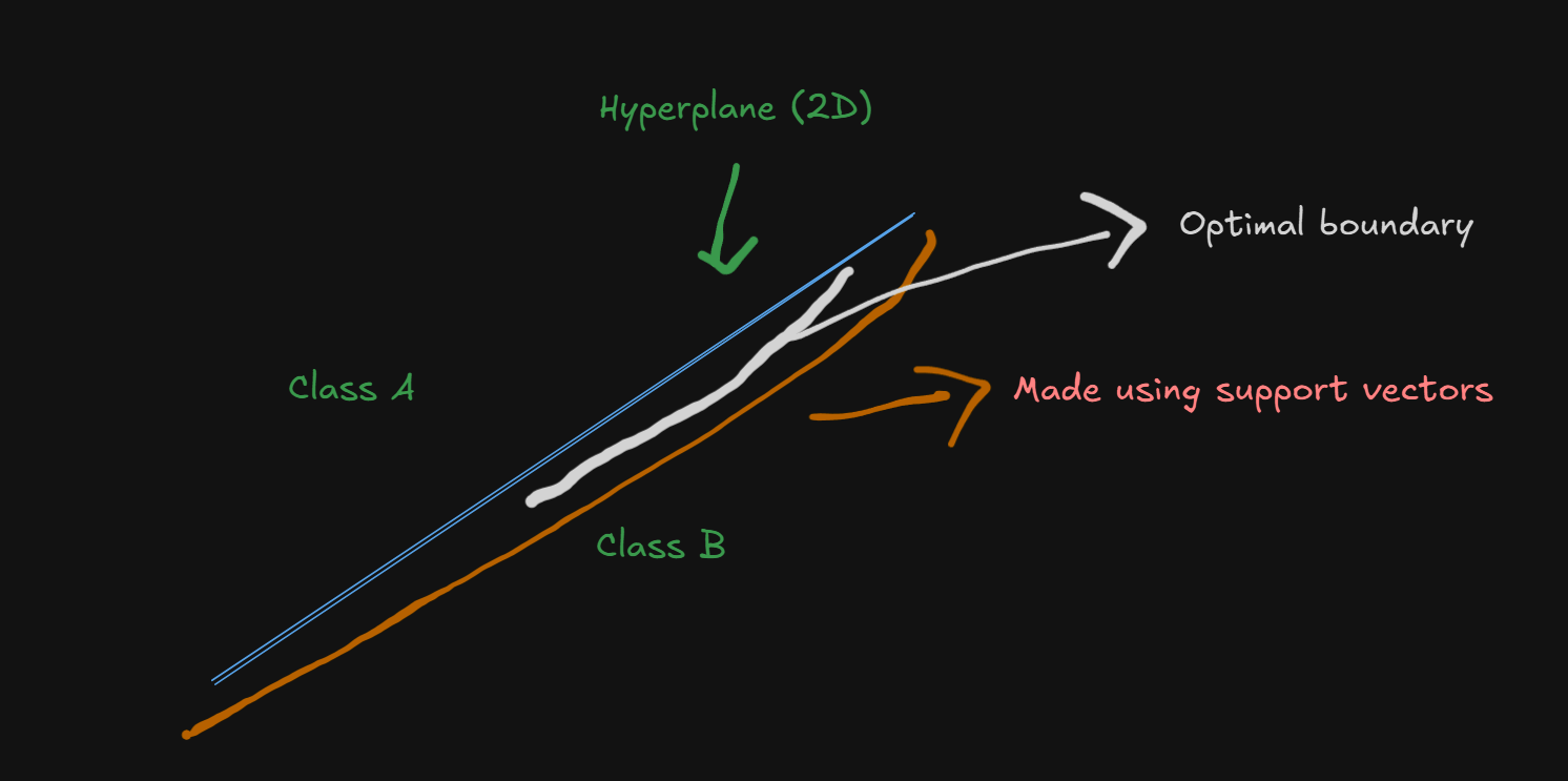
The "Support Vector" Concept
Support Vectors are the most important data points that define the decision boundary - like the pillars that hold up a bridge.
Analogy: Imagine you're a referee trying to draw a line between two opposing sports teams:
- Most players: Not critical for where you draw the line
- Support vectors: The few players closest to the boundary - these determine exactly where the line goes
- Optimal boundary: The line that maximizes distance from both teams' closest players
Suppose there's two classes of players in which the SVM needs to separate in order for future classifications, this is how it would look in 2D, conceptually.
The optimal boundary would be the region between the blue hyperplane and the orange arc , since that's the region where the support vectors would end up and determine where the hyperplane goes.
Now, let's dive into the mathematical part.
Part 1: The Geometric Foundation
Linear Separability
The Goal: Find a hyperplane that separates different classes with maximum margin.
In 2D: Hyperplane = Line
In 3D: Hyperplane = Plane
In Higher Dimensions: Hyperplane = Generalized plane
Mathematical Representation
Decision Boundary Equation:
where:
: The weight vector (perpendicular to the hyperplane) : The input feature vector : Bias term (shifts the hyperplane)
Let's hang back for a bit and understand this equation visually
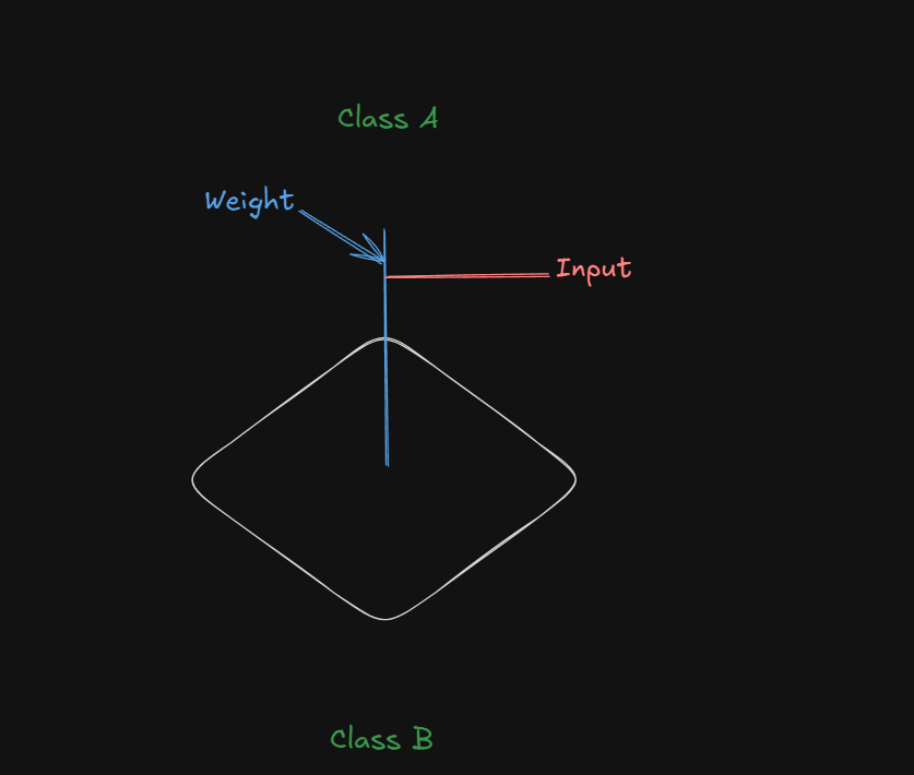
The white plane at the bottom is the hyperplane, separating between two classes, one on top, the other on the bottom.
The blue line, the weight, is perpendicular to the hyperplane, with the input factor
As for the bias, it's not directly visualized as a line, but rather as a force.
Let's come back to the diagram:
If we were to say that the model is more biased towards Class A:
Imagine an upward force, pushing the hyperplane towards class A:
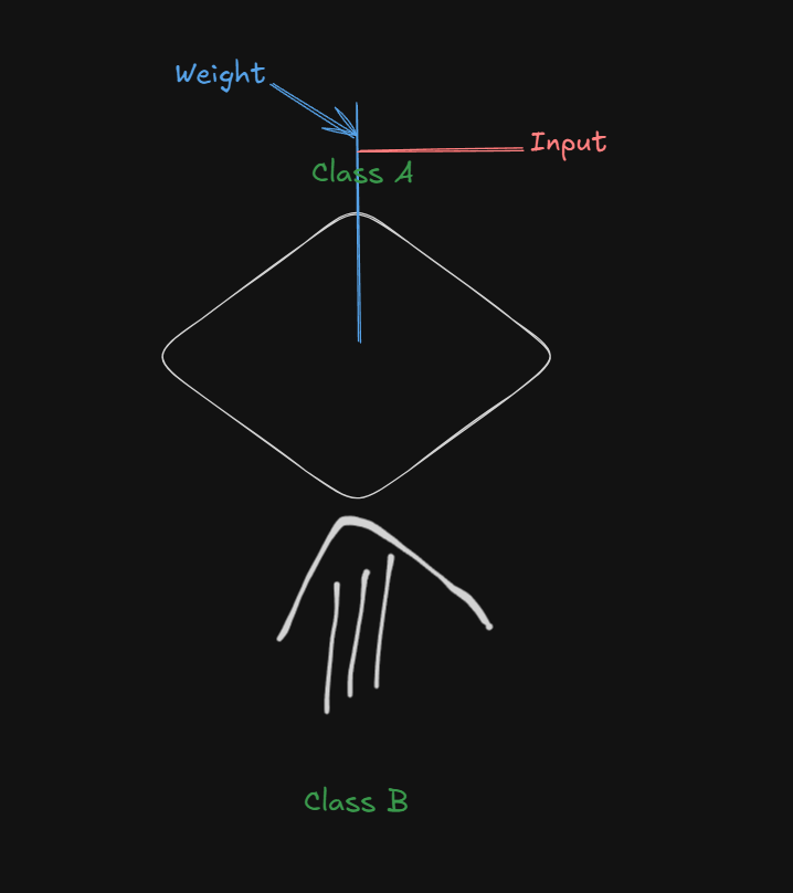
This is called a positive bias (
A similar high bias towards class B would be denoted as:
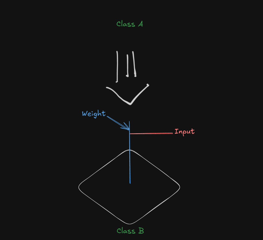
This is called a negative bias (
Do note that the bias acts on the weight vector, which, since being perpendicular to the hyperplane, is able to influence it's position.
Examples
Now let's finalize the understanding of SVMs with an example.
Problem Setup
Scenario: Predict whether students pass or fail based on study hours and attendance rate.
Dataset:
| Student | Study Hours (x₁) | Attendance % (x₂) | Result (y) |
|---|---|---|---|
| A | 2 | 60% | Fail (-1) |
| B | 8 | 90% | Pass (+1) |
| C | 3 | 70% | Fail (-1) |
| D | 7 | 85% | Pass (+1) |
| E | 5 | 80% | Pass (+1) |
Step 1: The SVM Equation
This is the base form of the equation.
Let's re-write to suit our dataset.
where:
And
Step 2: Learned Parameters (After Training):
Let's say SVM training gives us:
- w₁ = 0.4 (study hours coefficient)
- w₂ = 0.02 (attendance coefficient)
- b = -2.8 (bias)
So the SVM equation becomes:
Note that in theory, we can't figure out how the weights are calculated without having mathematical knowledge, that for now, would be considered overkill.
Step 3: Interpreting the Parameters:
Weight Vector Analysis:
- w₁ = 0.4: Each additional study hour contributes +0.4 to the "pass score"
- w₂ = 0.02: Each 1% increase in attendance contributes +0.02 to the "pass score"
- Magnitude comparison: Study hours have 20× more impact than attendance
Bias Analysis:
- b = -2.8: Negative bias means the hyperplane is "pulled" toward the origin
- Effect: Model is biased toward "Fail" - requires strong evidence to predict "Pass"
- Interpretation: "By default, assume students fail unless they have sufficient study hours/attendance"
Step 4: Making Predictions Step-by-Step
New Student: 6 study hours, 75% attendance
Step 4a: Calculate the decision function
Step 4b: Apply Decision Rule
From this section:
| Result (y) |
|---|
| Fail (-1) |
| Pass (+1) |
| Fail (-1) |
| Pass (+1) |
| Pass (+1) |
We can decide, from the distance value, whether the student passed or failed.
Since
The confidence of the SVM for this value (how sure it is that it's a pass):
where $$|w| \ = \ \sqrt{ \sum_{i=n}{(w_n)^2}}$$
Since we have two weights here:
Confidence:
Step 4c: Geometric Interpretation
- Student's data point is 1.1 units on the "Pass" side of the decision boundary
- The positive value indicates the student falls in the "Pass" region
- The magnitude (1.1) indicates confidence level
Step 5: Understanding the support vectors
Identifying Support Vectors:
Support vectors are training points where:
- Student B:
(not a support vector) - Student D:
(not a support vector)
Note: In practice, we'd need the exact support vectors from the training algorithm. So don't think too much about this step.
Support Vector Machines: Nonlinearity and Kernel Methods
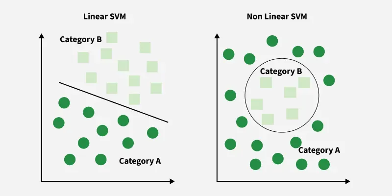
Now, SVMs, as cool they may seem, have a fundamental limitation by default.
The Linear SVM Limitation Problem
Remember our previous SVM discussions? We've been dealing with linearly separable data - where a straight line (or hyperplane) can perfectly separate classes. But what happens when real-world data looks like this:
Real-World Scenarios Where Linear SVMs Fail
Example 1: Concentric Circles
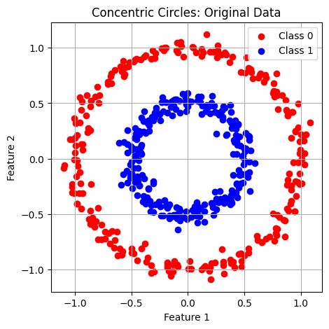
- Inner circle = Class A (e.g., "Safe zone")
- Outer circle = Class B (e.g., "Danger zone")
- Problem: No straight line can separate these classes!
Example 2: XOR Pattern
- Class 1: Points at (1,-1) and (-1,1)
- Class 2: Points at (1,1) and (-1,-1)
- Problem: Any straight line misclassifies at least one point
Example 3: Two Moons Dataset
- Crescent-shaped data distributions
- Problem: Curved boundary needed, not straight line
TLDR:
- In a Linear SVM, the decision boundary is:
(always a straight line/plane) - Real world: Data often has complex, curved relationships
- Result: Poor classification performance on non-linear patterns
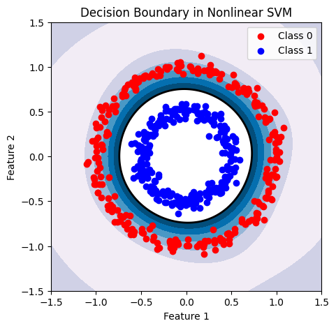
The Brilliant Solution: The Kernel Trick
The Core Concept
The kernel trick is like having "magical glasses" that let you see data in a new dimension where complex curved problems become simple straight-line problems!
How the Kernel Trick Works
Step 1: Feature Mapping (
Transform your original data to a higher-dimensional space using a mapping function
Mathematical Representation:
where:
: Original input space (e.g : 2D) : Higher-dimensional input space (e.g 3D, 10D, D)
Step 2: Linear Separation in New Space
In the higher-dimensional space, find a linear hyperplane that separates the classes.
Step 3: Map Back to Original Space
When mapped back to the original space, this linear boundary becomes a curved decision boundary!
The "Trick" Part: Computational Efficiency
The Magic: Instead of explicitly computing
Why This Is Brilliant:
- No explicit transformation needed
- Computationally efficient
- Works with infinite-dimensional spaces
Note: In practice, while coding using SVMs, we will directly call a kernel like this:
from sklearn.svm import SVC
model = SVC(kernel='linear', C=1.0)
model.fit(X_train, y_train)
predictions = model.predict(X_test)
Hyperparameter Understanding
- C parameter: Controls bias-variance tradeoff
- Kernel selection: Linear vs. polynomial vs. RBF
- Feature scaling: Critical for SVM performance
This is a linear kernel by default.
For a non-linear one (don't worry about the code too much, just observe):
from sklearn.svm import SVC
from sklearn.datasets import make_circles
from sklearn.model_selection import train_test_split

# Generate some non-linearly separable data
X, y = make_circles(n_samples=100, factor=0.5, noise=0.1)
X_train, X_test, y_train, y_test = train_test_split(X, y, random_state=42)

# Using RBF kernel
svm_rbf = SVC(kernel='rbf', gamma='scale') # 'scale' is a common default for gamma
svm_rbf.fit(X_train, y_train)
print(f"RBF Kernel Accuracy: {svm_rbf.score(X_test, y_test)}")

# Using Polynomial kernel
svm_poly = SVC(kernel='poly', degree=3, coef0=1)
svm_poly.fit(X_train, y_train)
print(f"Polynomial Kernel Accuracy: {svm_poly.score(X_test, y_test)}")
To get an output like this:
RBF Kernel Accuracy: 1.0
Polynomial Kernel Accuracy: 1.0
See how we directly called a Kernel function make_circles to map the linear data into non-linear data directly, without us having to do any of the hassle?
The Kernel we chose this time is the:
-
Radial Basis Function (RBF) Kernel:
- This is often the default and most commonly used kernel for non-linear problems.
- It can map data into an infinite-dimensional space.
- It has a parameter
gammawhich controls the influence of individual training samples. A smallergammameans a larger influence, and vice versa.
Other kernels include:
-
Polynomial Kernel:
- This kernel computes a polynomial transformation of the input data.
- It has parameters
degree(the degree of the polynomial) andcoef0(an independent term in the kernel function). - A
degreeof 1 is equivalent to a linear kernel.
-
Sigmoid Kernel:
- This kernel is derived from the hyperbolic tangent function and is sometimes used in neural network applications.
- It also has parameters
gammaandcoef0.
More in depth about these Kernels, below.
Choosing the right kernel and tuning its parameters (e.g., gamma for RBF, degree for polynomial) is crucial for achieving optimal performance on non-linear datasets. This often involves techniques like cross-validation and hyperparameter tuning.
Non-Linear SVMs : Example
Let's further cement our understanding of Kernels and Non-linear SVMs with an example.
Detailed Example: Transforming XOR Problem
Let's work through the famous XOR problem step-by-step to see the kernel trick in action.
Before that, What is the XOR Problem?
Cue back to Digital Electronics, Semester 3.
Definition of XOR
The XOR (exclusive OR) function takes two binary inputs and outputs 1 if the inputs differ, and 0 if they are the same. This function is a classic example of a non-linear problem because its outputs cannot be separated by a single straight line in a two-dimensional space.
And ofcourse, the problem with Linear Models (including Linear SVMs)
Challenges with Linear Models
Single-layer perceptrons(we will come to this terminology later), a type of neural network, cannot solve the XOR problem due to their inability to create non-linear decision boundaries. They can only classify linearly separable data, such as AND and OR functions, which can be divided by a straight line.
Original XOR Data (Linearly Inseparable)
| Point | x₁ | x₂ | Class |
|---|---|---|---|
| A | +1 | -1 | +1 |
| B | -1 | +1 | +1 |
| C | +1 | +1 | -1 |
| D | -1 | -1 | -1 |
Problem: No straight line can separate positive and negative classes.
Solution: Polynomial Kernel Transformation
Kernel Function:
The feature mapping.
How the new dataset would look. This, we need to figure out ourselves.
So, from the given kernel:
We can rewrite the equation to adjust to our dataset
This falls under the identity of :
So, we will have :
Now,
The Key Mathematical Insight
The z terms disappear because we're looking for the feature mapping
The Critical Realization
For the kernel trick to work, this must equal a dot product in the transformed space:
What This Dot Product Looks Like
If
Matching Terms: The "Reverse Engineering" Process
Now we match each term in our expanded kernel to terms in the dot product:
| Expanded Kernel Term | Must Equal | ||
|---|---|---|---|
Why the √2 Appears
For the term
If we set
The same logic applies to the
The Final Feature Mapping
Once we've identified how each term breaks down, the feature mapping
The z terms are gone because
Visual Analogy
Think of it like a recipe for cooking:
is like describing the combined flavor when two dishes (made from ingredients x and z) are tasted together is the recipe for preparing the dish from ingredients x is the recipe for preparing the dish from ingredients z - The "combined flavor" comes from the dot product of the two prepared dishes
When you want the recipe
So, coming back to the transformation the data:
Transformed Data in Higher Dimension
| Point | x₁² | x₂² | √2x₁x₂ | √2x₁ | √2x₂ | 1 | Class |
|---|---|---|---|---|---|---|---|
| A | 1 | 1 | -√2 | √2 | -√2 | 1 | +1 |
| B | 1 | 1 | -√2 | -√2 | √2 | 1 | +1 |
| C | 1 | 1 | √2 | √2 | √2 | 1 | -1 |
| D | 1 | 1 | √2 | -√2 | -√2 | 1 | -1 |
Result: In this 6D space, the classes become linearly separable!
The Magic of Kernel Computation
Instead of computing all those 6D coordinates, the kernel trick lets us compute:
Direct Kernel Calculation:
This single calculation replaces all the 6D dot product computations!
Major Kernel Functions (Don't think about this too much, just know the names, and the formulae if possible.)
1. Linear Kernel
Formula:
Use Case: When data is already linearly separable
Advantage: No transformation, fastest computation
Decision Boundary: Straight lines/hyperplanes
2. Polynomial Kernel (General form)
Formula:
Parameters:
- d: Degree of polynomial (
) - γ: Scaling parameter (gamma)
- r: Independent term
Use Case: When you need curved boundaries with polynomial shapes
Decision Boundary: Polynomial curves
Example Applications:
- Image recognition (feature interactions)
- Text classification (word combinations)
3. Radial Basis Function (RBF/Gaussian) Kernel
Formula:
Parameter:
- γ: Controls the "width" of the kernel
- Higher γ: More complex, curved boundaries
- Lower γ: Smoother, simpler boundaries
Use Case: Most versatile kernel for complex, non-linear patterns
Decision Boundary: Smooth, curved regions
Geometric Interpretation: Measures similarity based on distance - closer points have higher kernel values.
4. Sigmoid Kernel
Formula:
Use Case: Mimics neural network behavior
Decision Boundary: S-shaped curves
And that marks the end of this topic.
Beyond Binary Classification: Multi-class/Structured Outputs, Ranking
Part 1: Multi-class Classification
Core Concept
Multi-class classification extends binary classification to handle three or more classes. Each instance still gets assigned to exactly one class, but now we have more options to choose from.
Real-World Examples
Image Recognition: Classifying photos as "car," "truck," "bus," "motorcycle," or "bicycle"
Medical Diagnosis: Determining if a condition is "healthy," "mild," "moderate," or "severe"
Email Categorization: Sorting emails into "work," "personal," "promotions," or "social"
Key Approaches to Multi-class Problems
1. One-vs-Rest (OvR)
- Strategy: Train multiple binary classifiers
- Process: For each class, create a "this class vs. all others" binary problem
- Example: For 4 classes, train 4 binary classifiers
- Prediction: Choose the classifier with highest confidence
2. One-vs-One (OvO)
- Strategy: Train binary classifiers for every pair of classes
- Process: For n classes, train n(n-1)/2 binary classifiers
- Example: For 4 classes, train 6 binary classifiers (1v2, 1v3, 1v4, 2v3, 2v4, 3v4)
- Prediction: Use voting mechanism across all pairwise classifiers
3. Native Multi-class
- Strategy: Algorithms that naturally handle multiple classes
- Examples: Decision trees, naive Bayes, neural networks
- Advantage: Direct optimization for the multi-class objective
Multi-class SVM Extension
Building on our SVM knowledge, multi-class SVMs can use either:
- Multiple binary SVMs (OvR or OvO approach)
- Modified optimization to handle multiple classes simultaneously
Part 2: Structured Outputs
What Are Structured Outputs?
Structured outputs go beyond simple class labels to predict complex, interdependent structures. Instead of predicting a single value, we predict entire sequences, trees, or graphs.
Examples of Structured Prediction
Natural Language Processing:
- Part-of-speech tagging: Predict grammatical role for each word in a sentence
- Named entity recognition: Identify and classify entities (person, location, organization)
- Machine translation: Convert entire sentences between languages
Computer Vision:
- Image segmentation: Classify every pixel in an image
- Object detection: Identify objects and their bounding boxes
- Pose estimation: Predict joint locations for human poses
Bioinformatics:
- Protein folding: Predict 3D structure from amino acid sequence
- Gene sequence analysis: Identify functional regions in DNA
Key Characteristics
Interdependence: Output elements influence each other
Variable Size: Output structure can vary in length or complexity
Hierarchical: Outputs often have nested or tree-like structures
Constraint Satisfaction: Must satisfy domain-specific rules
Part 3: Ranking in Machine Learning
Learning to Rank (LTR)
Learning to rank is a supervised learning framework that aims to order objects according to their relevance, preference, or importance
Why Ranking Matters
Search Engines: Ranking web pages by relevance to user queries
Recommendation Systems: Ordering products by likelihood of user interest
Information Retrieval: Prioritizing documents by relevance
E-commerce: Ranking products by purchase probability
Types of Ranking Approaches
1. Pointwise Approach
- Strategy: Predict a score for each item independently
- Method: Train a regression model to predict relevance scores
- Example: Predict rating (1-5 stars) for each movie
- Limitation: Ignores relative relationships between items
2. Pairwise Approach
- Strategy: Learn to compare pairs of items
- Method: Train classifier to determine which item should rank higher
- Example: Given two movies, predict which user will prefer
- Algorithms: RankNet, RankSVM, LambdaMART
3. Listwise Approach
- Strategy: Consider entire ranked lists during training
- Method: Optimize ranking metrics directly (NDCG, MAP)
- Example: Learn to rank entire search result pages
- Algorithms: ListNet, ListMLE, LambdaMART
Ranking with SVMs
RankSVM extends SVM principles to ranking:
- Objective: Learn preferences between item pairs
- Constraint: For preferred item pairs
, ensure - Optimization: Maximize margin between preferred and non-preferred pairs\
Practical Applications
Multi-class in Action
- Medical diagnosis with multiple possible conditions3
- Document classification into multiple topics
- Image recognition for various object types1
Structured Outputs in Practice
- Automatic speech recognition: Convert audio to text sequences
- Optical character recognition: Extract text from images
- Autonomous driving: Detect and classify multiple objects simultaneously
Ranking Applications
- Web search: Google's PageRank and modern ranking algorithms(We covered this last semester) 9
- Netflix recommendations: Ranking movies by predicted user interest
- E-commerce: Amazon's product ranking and recommendations8